


Cobalt Blue
Cobalt blue is a clear, true blue with no green or violet lean, made from cobalt and aluminum. It has been the sky painter's blue since 1802.
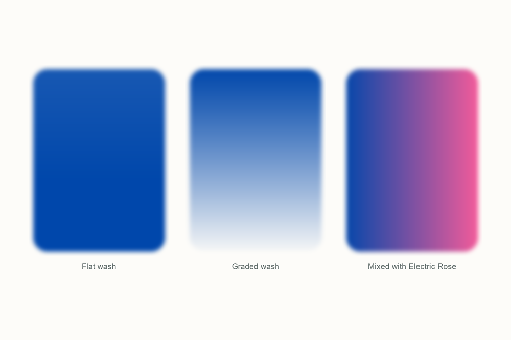
What color is cobalt blue?
| Hex | #0047AB |
| RGB | 0, 71, 171 |
| CMYK | 100, 58, 0, 33 |
| Warm or cool | Slightly cool, but close to neutral. Cooler than ultramarine, warmer than cerulean or phthalo blue. |
| On the wheel | Almost dead center in the blues. Ultramarine sits to its violet side, cerulean and phthalo to its green side. That neutrality is the whole point of it. |
The story of cobalt blue
Cobalt blue is the color of the sky in a painting when the painter could afford it.
People had been getting blue out of cobalt for a very long time before it was a paint. Cobalt glass from Mesopotamia goes back to around 2000 BC, and ground cobalt glass, called smalt, was a painter's blue in the 1500s and 1600s. It was coarse and it faded. What nobody had was a cobalt pigment that behaved like a proper paint.

In 1802 the French chemist Louis Jacques Thenard worked out how. He roasted cobalt salts with alumina at high heat and got a pure, stable blue crystal, cobalt aluminate. It was in commercial production by 1807 and it was immediately the best blue money could buy, because the only serious rival, genuine ultramarine, was made from ground lapis lazuli and cost more than gold. Thenard's blue was expensive too, just not insane.
Its reign at the top was short. In 1826 synthetic ultramarine arrived, chemically identical to the lapis version and a fraction of the price, and it took over as the everyday blue. Cobalt did not disappear, though. Painters kept it for what only it could do: a clean, granulating, middle-of-the-road blue that mixes without surprises. The Impressionists used it constantly, and Van Gogh called it a divine color, the best there was for putting atmosphere around things.

It is still one of the pricier tubes on the rack, because cobalt is a genuinely expensive metal. Most beginner sets, including ours, use a bright phthalo-type blue instead. I will show you how to get close.
Pigment facts
| Colour Index | PB28, cobalt aluminate. A single pigment. Anything sold as cobalt blue hue is a mixture, usually ultramarine with phthalo and white, made to imitate it cheaply. |
| Transparency | Semi-transparent. It sits between transparent ultramarine and opaque cerulean. |
| Lightfastness | Excellent. Cobalt blue is one of the most permanent blues there is. |
| Granulation | Yes, noticeably. In a wet wash the pigment settles into a soft, grainy texture that looks like real sky. |
| Staining | Low. It lifts well, which makes it forgiving. |
| Toxicity | Low in normal use. The pigment is a fired, ceramic-like compound that locks the cobalt in. Do not breathe the dry powder and keep brushes out of your mouth, and you are fine. |
These describe the pigment in general. Every brand's tube behaves a little differently, so test yours on scrap paper.
How to mix cobalt blue
You cannot mix a true cobalt blue, because it is a single pigment sitting right in the middle of the blues. What you can do is aim for its position on the wheel from either side. Start with a green-leaning blue and add a touch of a violet-leaning one, or the other way round, until the mix stops looking like sea or like dusk and just looks like blue.
What cobalt is really for is mixing other colors. Because it is neutral, it makes clean violets with a rose and clean greens with a lemon yellow, and it never drags a hidden green or purple into the result.
| Mix | Recipe | Best for |
|---|---|---|
| Cobalt from the kit | Glacier Blue with a touch of Twilight Indigo | Clear skies, water, anything that needs an honest blue |
| Clean violet | Cobalt with Electric Rose, about 1 to 1 | Lavender, shadows on snow, evening clouds |
| Clean spring green | Cobalt with Lemon Yellow, more yellow than blue | New leaves, bright grass |
| Cobalt gray | Cobalt with burnt sienna, leaning blue | Cloud shadows, distant hills, wet sand |
| Sky wash | Cobalt alone, plenty of water, on wet paper | Let it granulate and do nothing else to it |
Closest mix from the Tobio's kit
Glacier Blue with a touch of Twilight Indigo, roughly four to one. Glacier Blue on its own leans green and reads as tropical water; a little indigo pulls it back to a straight blue. Add water until it is the color of a clear afternoon. You will not get cobalt's granulation, but you will get its hue.
The 12-color kit does not include a tube of cobalt blue, so this is how I get there with what is in the palette. Running low on a color? The 12 paint refills drop straight into the wells.
Using cobalt blue in watercolor
Cobalt is the blue I use when I want the sky to look like sky and not like a color. On wet paper it granulates into that soft, slightly grainy texture that real air seems to have. Wet the paper, float the cobalt in at the top, tilt, and leave it alone. Fussing with it flattens the granulation.
It is also the best blue for learning to mix, because it does not pull surprises. Ultramarine sneaks violet into your greens; phthalo sneaks green into your purples. Cobalt does neither, so a beginner gets more predictable results from it than from anything else.
Because it is semi-transparent and lifts easily, it is forgiving. Painted a sky too dark? Blot it with a clean damp brush while it is wet and most of it comes back off.
The one warning is price. A tube of genuine cobalt costs three or four times what a phthalo does. If your set says cobalt blue hue, that is a mixture pretending, and it will be brighter, stronger and less granulating than the real thing. Not worse. Just different, and worth knowing.
Everything I use on this page is the Tobio's Watercolor Kit: twelve colors chosen to mix, a walnut palette, cotton paper, and a water brush. Want to see how any two of the colors blend before you commit? Try the interactive color mixing chart.
Get the kitCobalt blue vs ultramarine (and royal blue)
Ultramarine is the blue most people already own, and the difference matters. Ultramarine leans toward violet, is more transparent, granulates more heavily, and has much stronger tinting power. Cobalt is straighter, a little cooler, semi-transparent, and quieter in mixes. If you want a sky that glows toward purple at the top, ultramarine. If you want a sky that just looks like a clear day, cobalt.
Royal blue is not a pigment at all. It is a color name from the 1800s for a deep, slightly purple blue, and it is closest to a saturated ultramarine. Cobalt is lighter and brighter than royal blue. If a design brief says royal blue, reach for ultramarine; if it says cobalt, it means this.
Cerulean is the third one worth knowing: greener, opaque, and pale. It is what you use for the sky right at the horizon, with cobalt above it and ultramarine at the very top.
Questions people ask
What color is cobalt blue?
Is cobalt blue warm or cool?
What is the difference between cobalt blue and ultramarine?
Is cobalt blue toxic?
What colors make cobalt blue?
Cobalt blue vs royal blue: which is which?
Sources
More color stories
