


Ultramarine Blue
Ultramarine is a deep, slightly violet blue, once ground from the stone lapis lazuli and since 1828 made from clay, soda and sulfur. It is the standard warm blue on most watercolor palettes.
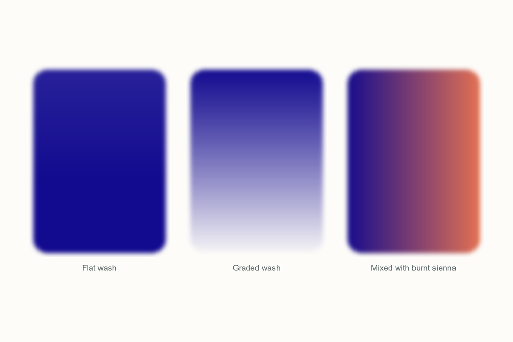
What color is ultramarine?
| Hex | #120A8F |
| RGB | 18, 10, 143 |
| CMYK | 87, 93, 0, 44 |
| Warm or cool | Cool, but the warm one among the blues. The small red lean is what makes clean violets and quiet, olive greens. |
| On the wheel | A deep blue leaning toward violet, on the red side of blue and roughly opposite yellow-orange, which is why burnt sienna knocks it so neatly into gray. |
The story of ultramarine
Ultramarine is a rock from one valley in Afghanistan, ground up and washed, and for centuries it cost more than gold.
The rock is lapis lazuli, from the Sar-i Sang mines in Badakhshan, which have been worked for more than 6,000 years. The stone is not pure blue. Only about a third of it is lazurite, the blue part; the rest is white calcite and brassy pyrite, and grinding the lot gives you a gray-blue dust. The fix, first described by Ahmad al-Tifashi in the 1200s and written down for European painters by Cennino Cennini around 1400, was to knead the powder into a dough of pine resin, mastic and wax, then work that dough in warm lye the way you would knead bread. The blue sinks out into the lye; the gray stays in the dough. Clean powder cost about ten times what the stone did, and Venice sold it on as the blue from beyond the sea.

Painters rationed it accordingly. Through the 1300s and 1400s the best blue went on the robe of the Virgin Mary and almost nowhere else, and Sienese workshops stretched it with lead white. Cennini called it a glorious, lovely and absolutely perfect pigment beyond all the pigments, which for a technical manual is quite a sentence. Vermeer was still paying for it two centuries later: the turban in Girl with a Pearl Earring is ultramarine cut with lead white, glazed with the pure stuff on top.

Then chemistry got involved. Blue crusts had been turning up inside lime kilns for years, and in 1824 the Societe d'Encouragement pour l'Industrie Nationale offered 6,000 francs to anyone who could make an artificial ultramarine for under 300 francs a kilo. Jean-Baptiste Guimet worked out a recipe in 1826, kept it to himself, and collected the prize on February 4, 1828. Christian Gmelin in Tubingen published a similar method a month later. Guimet's blue sold for about 400 francs a pound when the real thing cost 3,000 to 5,000, and by 1830 he had a factory at Fleurieu-sur-Saone. The recipe is almost insulting: china clay, soda, sulfur and charcoal, cooked in a kiln at 700 to 750 degrees Celsius.
Everything sold as ultramarine today is Guimet's kind. The chemistry matches the stone, a sodium aluminum silicate with sulfur locked in the lattice, so it carries the same Colour Index code, PB29; the synthetic particles are just smaller and more even, which makes the color cleaner. French ultramarine began as the name for Guimet's version and is now mostly a grade name on a tube. Yves Klein built International Klein Blue on it around 1960, suspended in a resin binder that kept its dry, powdery depth.
Here is the part that gets me. For centuries the color was rationed to one robe per altarpiece, and then a clay-and-sulfur recipe made it a blue anyone could afford. A painter in 1400 needed a patron to buy what I use for a sky. I try to remember that when I am slopping it over a whole sheet, and then I slop it anyway.
Pigment facts
| Colour Index | PB29 (Colour Index 77007). A sodium aluminum silicate with sulfur trapped in the crystal, Na8-10Al6Si6O24S2-4; the blue comes from a sulfur radical in the lattice. Natural ultramarine from lapis lazuli has the same chemistry and code. |
| Transparency | Transparent to semi-transparent. Thin washes glow and the paper shows through even at medium strength. |
| Lightfastness | Excellent; it has survived in manuscripts and panel paintings for centuries. Its one enemy is acid: even vinegar can bleach it. |
| Granulation | Strong. In a wet wash the particles drift into the tooth of the paper and dry speckled, which I like in a sky and curse in a flat wash. |
| Staining | Low. It lifts easily with a damp brush even after drying: forgiving, but a second wash can disturb the first. |
| Toxicity | Non-toxic. Modern PB29 is cooked from clay, soda, sulfur and charcoal, and the same pigment goes into laundry bluing and mascara. |
These describe the pigment in general. Every brand's tube behaves a little differently, so test yours on scrap paper.
How to mix ultramarine
Nothing on a palette makes ultramarine. It is as close to a primary blue as watercolor gets, so you buy it, and the useful question is what it makes. Grays, mostly. Ultramarine with burnt sienna is the most used pairing in landscape painting for a reason: two to one gives a soft, cool shadow gray, tipped toward the brown it gives warm stone, and the same pair is how most painters mix their own Payne's gray.
Its second trick is violet. Because it already leans red, a cool red like Poppy Bloom turns it into a clean purple where a greener blue would go muddy. With yellow it makes quiet, olive greens rather than bright ones: a gift for foliage, a fault for a lime.
| Mix | Recipe | Best for |
|---|---|---|
| The landscape gray | 2 parts ultramarine, 1 part burnt sienna | Shadows, clouds, distant hills |
| Warm stone gray | The same mix, tipped toward the burnt sienna | Walls, rocks, wet pavement |
| Clean violet | Ultramarine and a cool red such as Poppy Bloom, roughly equal | Dusk hills, shadows on flowers |
| Olive green | Ultramarine and yellow ochre, one to two | Foliage in shade, hedges |
| Deep dark | Ultramarine and burnt umber, half and half | Tree trunks, doorways, a near-black with warmth |
Closest mix from the Tobio's kit
Twilight Indigo is the closest thing in the kit and does most of the work alone. Deepen it with a speck of Ivory Black; if it reads too electric, a small touch of Venetian Red pulls it toward the dusty violet-blue of the real thing. I keep Glacier Blue out of this one, since it drags the mix toward green and ultramarine leans the other way. Add water until it looks like a sky you would paint, and test on scrap first.
The 12-color kit does not include a tube of ultramarine, so this is how I get there with what is in the palette. Running low on a color? The 12 paint refills drop straight into the wells.
Using ultramarine in watercolor
Use it for anything far away. Ultramarine is the blue of distance: the sky at the top of the sheet, hills three ridges back, the shadow side of a white house. It is also the blue I want in a mixed shadow, because its red lean stops a gray from going green.
Wet-on-wet is where it shows off. Wet the paper, drop ultramarine along the top edge, tilt the board and let it run; as it dries the particles settle into the grain and you get a sky with texture in it for free.
It pairs with the earths: burnt sienna for grays, yellow ochre for greens that look like actual plants, Venetian Red for a warm dark. For bright greens use Glacier Blue instead.
One warning I learned the hard way. It lifts. A second wash over a dry ultramarine passage will pick the first one up and move it, so let the first layer dry completely and touch it once, lightly.
Everything I use on this page is the Tobio's Watercolor Kit: twelve colors chosen to mix, a walnut palette, cotton paper, and a water brush. Want to see how any two of the colors blend before you commit? Try the interactive color mixing chart.
Get the kitUltramarine vs cobalt blue (and phthalo blue)
Cobalt blue is the nearest neighbor. Cobalt is cobalt aluminate, worked out by Louis Jacques Thenard in 1802, and it sits nearer the middle of blue: less violet, a touch lighter, and it dries to a softer, more even wash. Side by side, ultramarine looks like evening and cobalt looks like midday.
Phthalo blue is the other one. It is a copper phthalocyanine, launched in 1935 as Monastral Blue, and it is everything ultramarine is not: green-leaning, staining, smooth, and so strong that a speck colors a whole puddle. It takes over a painting if you let it.
I keep ultramarine for skies and shadows, cobalt for a blue that stays out of the way, and phthalo for the sea. If ultramarine is the sky over the sea at dusk, cobalt is the same sky at noon, and phthalo blue is the swimming pool.
Questions people ask
What color is ultramarine?
Is ultramarine warm or cool?
What colors make ultramarine?
Is ultramarine toxic?
Ultramarine vs French ultramarine, what is the difference?
Why was ultramarine so expensive?
Sources
More color stories
