


Viridian
Viridian green is a cool, transparent blue-green made from hydrated chromium oxide (PG18). It has been in paint boxes since 1838, and the viridian color is quieter and grayer than the green most beginners are hoping for.
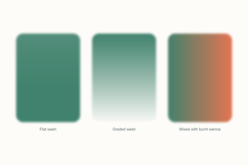
What color is viridian?
| Hex | #40826D |
| RGB | 64, 130, 109 |
| CMYK | 51, 0, 16, 49 |
| Warm or cool | Cool. There is more blue than yellow in it, which is why a thin wash reads like shallow sea water rather than grass. |
| On the wheel | A blue-green, sitting between green and teal on the wheel. It is dark in value and only medium in saturation, which is why it never shouts. |
The story of viridian
Viridian spent its first twenty years as a Paris trade secret that cost three to four times as much as the poison it was up against.
Chromium had been discovered in 1797. In 1838 a Paris color maker called Pannetier and his assistant Binet worked out how to make a hydrated form of chromium oxide, a green with water locked inside its crystals, and kept the recipe to themselves. Turner had it on his palette by 1840 all the same. Then in 1859 the French chemist C. E. Guignet patented a cheaper route: cook boric acid with potassium bichromate, wash the result, and you have the same green for a fraction of the effort. In French it is vert émeraude, which is about to get confusing. The English word, from the Latin viridis, was in use by the 1860s.
The green it was up against was emerald green, a copper and arsenic compound that poisoned the workers who made it. Viridian was the safe one. It was also transparent and permanent. The catch was price: three to four times what emerald green or chrome green cost, so plenty of painters kept buying the poison. And since vert émeraude translates as emerald green, the same words meant a safe pigment in Paris and arsenic in London.

Then the Impressionists arrived, and viridian turned out to be the green they wanted: cool, see-through, and well behaved. Conservators keep finding it. The Art Institute of Chicago found viridian in Monet's Arrival of the Normandy Train, Gare Saint-Lazare from 1877 and again in his Water Lily Pond of 1900. Renoir mixed it with chrome yellow and lead white for the rushes in La Yole. Cezanne used it, with emerald green beside it, in the dark grass at his family's estate outside Aix. Van Gogh's Café Terrace at Night is Prussian blue and viridian.

What you buy today under the name is still the real thing, PG18, if the label says so. Plenty of tubes called viridian hue contain no viridian at all; they are phthalo green, which is far stronger and a different animal. The genuine pigment looks dark and dull in the pan, and that is the moment most beginners put it back on the shelf.
I think viridian is the most misunderstood green in the box. Straight from the pan it looks like a wet slate roof. Its talent is what it does to other colors. A little into a yellow gives a real leaf, a little into burnt sienna gives every gray-green in a hedge, and it never barges in the way phthalo does. It is the difference between a colleague who is loud and one who is useful.
Pigment facts
| Colour Index | PG18 (Colour Index 77289): hydrated chromium(III) oxide, Cr2O3 with water locked into the crystal. A single pigment, not a mixture. Its dull cousin without the water is chromium oxide green, PG17. A tube labeled viridian hue is phthalo green (PG7). |
| Transparency | Transparent. Even at full strength it never goes opaque, and thin washes let the paper shine straight through. |
| Lightfastness | Excellent. It is unaffected by light, by heat up to 260 degrees Celsius, and by boiling acids and alkalis. |
| Granulation | Moderate, in my experience. On rough paper it settles into a soft, speckled wash; on smooth paper it barely shows. |
| Staining | Low, in my experience. It lifts back to near white with a damp brush even after drying, which is the opposite of phthalo green. |
| Toxicity | Low in normal use. Chromium in this form is not the dangerous kind; the chromates used to manufacture it are highly toxic, and dry pigment dust can irritate skin, eyes and lungs. |
These describe the pigment in general. Every brand's tube behaves a little differently, so test yours on scrap paper.
How to mix viridian
You can get near viridian's hue from a blue-green plus a whisper of yellow, but you cannot copy its behavior. Its transparency and the way it settles into the paper come from the crystals, not the hue. The pairing that matters is viridian with burnt sienna. Equal parts give a warm, soft gray. Tip it toward the green for lichen and moss, toward the brown for tree bark in shade.
Mix it wet and let it sit. Viridian rewards patience on the paper and punishes fiddling. If a mix goes dull, add water rather than more pigment; the transparency comes back.
| Mix | Recipe | Best for |
|---|---|---|
| Lichen gray | Viridian and burnt sienna, roughly equal | Stone walls, tree trunks, weathered wood |
| Real leaf green | Viridian with lemon yellow, two to one, and a touch of burnt sienna | Summer foliage, grass in shade |
| Shallow sea | Viridian with cobalt blue and plenty of water | Coastal water, glass, low sky |
| Neutral shadow | Viridian with a cool red such as Poppy Bloom, until neither wins | Shadows on white walls, snow, the underside of clouds |
| Deep hedge | Viridian with a touch of Twilight Indigo | Yew, cypress, woodland at dusk |
Closest mix from the Tobio's kit
Forest Green and Glacier Blue, three to one, then the smallest touch of Titanium White to give it viridian's milky, cool look in a wash. Forest Green is too warm and too dark on its own; the blue cools it and the white softens it. Viridian is transparent, so the closest you can get is a pale, watery version rather than a thick one. Test on scrap first and stop while it still looks like a shadow on the sea.
The 12-color kit does not include a tube of viridian, so this is how I get there with what is in the palette. Running low on a color? The 12 paint refills drop straight into the wells.
Using viridian in watercolor
Use it for the greens that are not really green: the shadow side of a hedge, sea water over sand, the far hill, the moss on a wall. Beginners mix those badly because they start bright and try to dull it down. Viridian starts dull and stays clean, which is easier.
Glazing is its best trick. Lay a thin wash of viridian over a dried yellow ochre or a dried lemon yellow and you get a glowing olive or a spring green that neither color can make alone. On rough paper, let a strong wash dry untouched and the pigment settles into the hollows: free texture for stone and bark.
It pairs with the warm earths and the cool reds. Venetian Red or burnt sienna with viridian makes a full range of grays without a tube of gray. Poppy Bloom kills it to a neutral shadow. Lemon Yellow wakes it into leaf.
One thing I learned the hard way: I once bought a pan labeled viridian hue, put it where my viridian lived, and spent a month wondering why every green mix was suddenly bullying the painting. It was phthalo green in a costume. Read the label. If it says PG7, it is not viridian.
Everything I use on this page is the Tobio's Watercolor Kit: twelve colors chosen to mix, a walnut palette, cotton paper, and a water brush. Want to see how any two of the colors blend before you commit? Try the interactive color mixing chart.
Get the kitViridian vs phthalo green (and chromium oxide green)
Phthalo green (PG7) is the one people swap in by mistake, and the hue is close enough to fool you in the pan. On paper they are opposites. Phthalo stains, dries flat, and takes over any mix in seconds. Viridian lifts, settles into the paper, and has modest tinting strength, so add it generously rather than by the speck.
Its dry cousin, chromium oxide green (PG17), is the same chromium oxide without the water in the crystal. That single difference turns a transparent blue-green into an opaque, dull olive. It is useful for army-blanket greens and for knocking back other greens, but it has none of viridian's glow.
If viridian is a glass of sea water, phthalo green is the same water with dye poured in, and chromium oxide green is the moss on the pier.
Questions people ask
What color is viridian green?
Is viridian green warm or cool?
What colors make viridian green?
Is viridian green toxic?
Viridian vs phthalo green, what is the difference?
What is the viridian color used for in painting?
Sources
More color stories
