


Cerulean Blue
Cerulean blue is a light, slightly greenish sky blue made from cobalt and tin. It is the blue painters use for the sky near the horizon, and it has been in watercolor boxes since the 1860s.
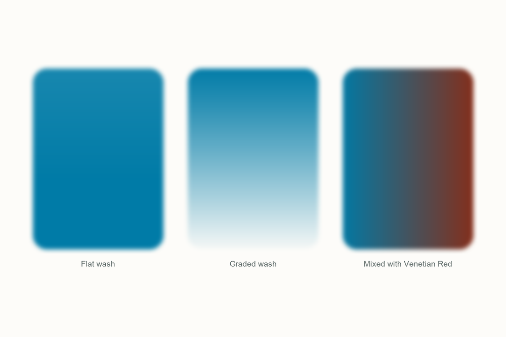
What color is cerulean blue?
| Hex | #007BA7 |
| RGB | 0, 123, 167 |
| CMYK | 100, 26, 0, 35 |
| Warm or cool | Cool. The green lean is what makes it read as daylight rather than dusk. |
| On the wheel | A blue that leans toward green, between cobalt blue and turquoise on the cool side of the wheel, a long way from ultramarine's violet. |
The story of cerulean blue
Cerulean blue was a watercolor before it was anything else, and before that it was a Swiss magazine editor's side project that nobody bought for seventy years.
Albrecht Höpfner made the first batch in 1789 by roasting cobalt and tin oxides together, and published the recipe in the nature magazine he edited, under a title that translates as some small chemical experiments by the editor. That was the whole announcement. The pigment was known as Höpfner blue and sat in the background for decades while painters got on with Prussian blue and, from 1802, the new cobalt blue. A paler, chalkier cobalt was not an obvious thing to want.
London changed its mind at the end of the 1850s. The Times carried an advertisement in December 1859 for caeruleum, a new permanent color for artists, and the color merchant George Rowney had it on sale in the early 1860s, though the firm of Roberson had quietly been buying the same blue from a German maker before him. For its first decade it was sold only as a watercolor. Oil painters did not get it until the 1870s, and that is when it took off.

The Impressionists wanted it because it did something no other blue did: it stayed pale and slightly green at full strength, which is what daylight looks like near the horizon. Monet had it on his palette by 1877. When the National Gallery in London analyzed his Gare Saint-Lazare from that year, they found a nearly pure patch of cerulean in the shadows under the station canopy and suggested it was there because it was greenish enough to stand in for Prussian blue. Berthe Morisot painted the blue coat in Summer's Day, from 1879, with cerulean alongside ultramarine and cobalt. Van Gogh made his own approximation from cobalt blue, cadmium yellow and white, which is a mixing lesson in one sentence.

What you buy today is still Höpfner's cobalt stannate, PB35, and it is one of the pricier tubes on the rack because cobalt is a pricey metal. The name has had a life of its own as well. The United Nations put cerulean on its emblem at the end of the Second World War because the designer, Oliver Lundquist, wanted the opposite of red, the color of war. Pantone made it the first ever Color of the Year in 2000. There is even a speech about a cerulean sweater in The Devil Wears Prada.
Here is my take. Cerulean is not a blue you need on day one. It is the blue you buy after you have painted a hundred skies with ultramarine and noticed they all look like the same evening. It does one thing, the pale daylight blue where the sky meets the ground, and it does it with a grain that looks like weather. A magazine editor's afternoon experiment turned out to be the most honest sky color we have.
Pigment facts
| Colour Index | PB35, cobalt(II) stannate: cobalt and tin oxides fired together. Tubes labeled PB36 swap the tin for chromium and run darker and greener. Cerulean blue hue is a mixture made to imitate it. |
| Transparency | Semi-opaque, the most covering of the everyday blues. Thin washes dry slightly chalky, which is why it was once not recommended for watercolor at all. |
| Lightfastness | Excellent. Cobalt stannate is inert and does not change in light. |
| Granulation | Yes, and it is the reason to buy it. In a wet wash the pigment settles into a fine, even grain that reads as air. |
| Staining | Low. It sits on the surface of the paper and lifts with a damp brush even after drying. |
| Toxicity | Low in normal use. The pigment is a fired, ceramic-like cobalt compound and chemically inert. Cobalt dust irritates the lungs, so do not breathe the dry powder, and keep brushes out of your mouth. |
These describe the pigment in general. Every brand's tube behaves a little differently, so test yours on scrap paper.
How to mix cerulean blue
You cannot mix a convincing cerulean, and I have tried. A green-leaning blue with a little white gets you the hue, but the chalky, granulating body is the pigment's own. If you want a stand-in, thin a phthalo blue a long way and accept that it will dry smoother and stain harder.
One pairing matters more than the rest: cerulean with a red earth. Cerulean and burnt sienna make a soft, granulating cloud gray; cerulean with Venetian Red makes the warmer gray for the shadow side of a cumulus. That pair has painted most of the skies I have ever needed.
| Mix | Recipe | Best for |
|---|---|---|
| Horizon sky | Cerulean alone, lots of water, on damp paper | The pale band of sky just above the horizon, under a deeper blue |
| Cloud shadow gray | Cerulean with a touch of Venetian Red, about three to one | The underside of cumulus clouds, distant haze |
| Granulating gray | Cerulean and burnt sienna, roughly equal | Wet rocks, weathered wood, water under cloud |
| Spring green | Cerulean with Lemon Yellow, more yellow than blue | New leaves, sunlit grass, lettuces |
| Snow shadow | Cerulean with a speck of Electric Rose | Shadows on snow and white walls that need to stay cool |
Closest mix from the Tobio's kit
Glacier Blue with a little Titanium White, roughly three to one, then the smallest speck of Venetian Red to take the electric edge off. The white gives it cerulean's chalky body and the red dulls it toward a real sky. Keep it wet and do not stir it smooth, so it settles a little the way the true pigment does. Test on scrap first; a speck of Venetian Red goes a long way.
The 12-color kit does not include a tube of cerulean blue, so this is how I get there with what is in the palette. Running low on a color? The 12 paint refills drop straight into the wells.
Using cerulean blue in watercolor
Use cerulean where the sky meets the ground. Real skies get paler and slightly greener toward the horizon, and cerulean is that color straight from the pan. Wet the paper, run ultramarine or cobalt along the top and cerulean along the bottom, tilt once, and leave it. The granulation does the rest.
It is also the quiet hero of distance. A hill five miles away is not green, it is a gray-blue, and cerulean with a touch of Venetian Red gets that in one go.
Because it is opaque, it will sit on top of a dried wash rather than glaze into it. That makes it useful for painting a pale sky back over one that went too dark, and useless for clean layered glazes. Keep the transparent blues for glazing and let cerulean do the covering.
Something I learned the hard way: cerulean dries chalky and lighter than it looks wet, and if you fuss with a wash it turns to dust on the paper. Put it down in one pass, a little stronger than feels right, and walk away.
Everything I use on this page is the Tobio's Watercolor Kit: twelve colors chosen to mix, a walnut palette, cotton paper, and a water brush. Want to see how any two of the colors blend before you commit? Try the interactive color mixing chart.
Get the kitCerulean blue vs cobalt blue (and phthalo blue)
Cobalt blue is the older sibling and the one people mix it up with, since both are cobalt pigments. Cobalt is a straight, neutral blue, semi-transparent, with a soft granulation. Cerulean is paler, greener and opaque. Put them in one sky and the order is obvious: cobalt overhead, cerulean at the horizon.
Phthalo blue is the modern blue people buy instead, and it is a different animal. It is transparent, it stains, and it is far stronger, so a brush loaded with phthalo will take over a sky that cerulean would only have tinted. Phthalo is the better mixing blue and cerulean is the better sky.
If you can only carry two, take cobalt and cerulean; they share a family and a temperament. Cobalt blue is the sky overhead, cerulean is the sky where it touches the sea, and phthalo is the deep water under both.
Questions people ask
What color is cerulean blue?
Is cerulean blue warm or cool?
What colors make cerulean blue?
Is cerulean blue toxic?
Cerulean blue vs cobalt blue, what is the difference?
When was cerulean blue invented?
Sources
More color stories
