


Sepia
Sepia is a deep, warm, black-brown named after the cuttlefish whose ink it was once made from. Today it is a mixture of earth brown and black.
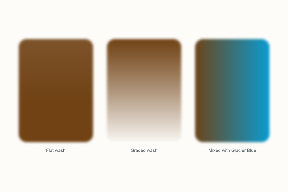
What color is sepia?
| Hex | #704214 |
| RGB | 112, 66, 20 |
| CMYK | 0, 41, 82, 56 |
| Warm or cool | Warm, but quietly. It has less red than burnt sienna and none of raw umber's green, which is why it reads as a neutral dark. |
| On the wheel | A dark brown that leans very slightly toward orange. It sits beyond burnt umber on the way to black, on the warm side, opposite the blues. |
The story of sepia
Sepia is the only watercolor named after an animal, and the animal made it in self-defense.
Cuttlefish squirt a cloud of dark ink to escape predators. The Greek word for the creature is sepia, and the Greeks and Romans collected that ink to write with. It was a permanent, pleasant brown-black, and it stayed a writing ink for a very long time before anyone thought of it as paint.
The person who made that leap was Jacob Seydelmann, a professor in Dresden, around 1780. He worked out how to dry and grind the ink and bind it with gum arabic into a watercolor. It arrived at exactly the right moment. Artists in the late 1700s and 1800s were mad for tonal wash drawings, monochrome landscapes built from one brown in a dozen dilutions, and sepia was perfect for it: transparent, soft and warm. A lot of the drawings in museums that people call sepia are actually bistre, a soot-based brown that is cooler and greener, but the name stuck to the whole genre.

Then photography borrowed it. In the 1880s printers started toning photographs with sulfur compounds, partly to make them last longer, and the result was that same warm brown. Sepia stopped meaning a cuttlefish and started meaning old. It is why the filter on your phone is called sepia and why every period drama poster looks the way it does.

Genuine cuttlefish sepia had one problem: it faded. Modern tubes solve that by skipping the cuttlefish entirely. What you buy today is a brown earth, usually burnt umber, darkened with a black. It is more permanent, more consistent, and it still does the one thing sepia has always done best, which is make a picture feel like a memory.
Pigment facts
| Colour Index | A mixture. Most modern sepias combine a natural or synthetic brown earth (PBr7 or PR101) with a black (PBk6, PBk7 or PBk9). Genuine cuttlefish sepia is no longer used in paint. |
| Transparency | Semi-transparent to transparent, depending on how much black is in the mix. |
| Lightfastness | Excellent in modern versions. The original cuttlefish ink faded badly, which is part of why it was replaced. |
| Granulation | Light. Earth-based sepias granulate gently; the black tends to smooth it out. |
| Staining | Moderate. It lifts while damp but leaves a ghost once dry. |
| Toxicity | Non-toxic. It is earth and carbon. |
These describe the pigment in general. Every brand's tube behaves a little differently, so test yours on scrap paper.
How to mix sepia
Sepia is one of the easiest colors to mix yourself, because that is literally how the tube is made. Burnt umber with a little black gets you there in one step. If you do not have umber, burnt sienna plus a good gray does it too.
The useful trick is going the other way: thinning it. One sepia diluted into five or six strengths gives you an entire monochrome painting, which is how it was used for two hundred years and is still the best exercise I know for learning values.
| Mix | Recipe | Best for |
|---|---|---|
| Sepia from scratch | Burnt umber with a touch of black, about 4 to 1 | Tonal studies, ink-and-wash, tree trunks |
| Sepia without umber | Burnt sienna with Payne's gray, roughly equal | When the palette has no umber in it |
| Cool sepia | Sepia with a touch of Glacier Blue | Shadows in an otherwise warm scene, wet rocks |
| Old-photo wash | Sepia very dilute, one even layer over a finished drawing | The vintage look, instantly |
| Almost black | Sepia with Twilight Indigo | Deep darks that stay warm instead of dead |
Closest mix from the Tobio's kit
Venetian Red and Ivory Black, roughly two to one, then a speck of Forest Green to kill the pink. Venetian Red brings the warmth, black brings the depth, and the green is what turns a dark red into a brown. Test on scrap and add water; sepia should look like strong tea before it looks like coffee.
The 12-color kit does not include a tube of sepia, so this is how I get there with what is in the palette. Running low on a color? The 12 paint refills drop straight into the wells.
Using sepia in watercolor
Use sepia when you want a picture to feel remembered rather than seen. A whole sketch in sepia, from pale wash to dense dark, reads as calm and old-fashioned in the best way. It is the color I use for quick tonal studies before a painting, because it forces me to think about light and dark and nothing else.
It is also the friendliest brown for line-and-wash. Draw in waterproof pen, then float sepia washes over the top and the two agree with each other completely, where a cooler brown can look like a mistake.
In a full-color painting, keep it for the warm darks: the inside of a doorway, the shadow under a bench, the trunk of a tree in evening light. It is deeper than burnt sienna and warmer than Payne's gray, so it fills the gap between them.
One habit worth keeping: dilute more than you think. Sepia at full strength is nearly black and loses all its warmth. The beautiful version is the middle strength, where it turns the color of a good cup of tea.
Everything I use on this page is the Tobio's Watercolor Kit: twelve colors chosen to mix, a walnut palette, cotton paper, and a water brush. Want to see how any two of the colors blend before you commit? Try the interactive color mixing chart.
Get the kitSepia vs burnt umber (and Van Dyke brown)
Burnt umber is the closest neighbor and the usual ingredient. On its own, umber is a mid-dark brown with a faint green cast from its manganese. Sepia is umber taken further: darker, a little warmer, closer to black. If you can see individual brushstrokes easily, it is probably umber; if the dark area reads as a soft near-black, it is probably sepia.
Van Dyke brown is the other one people ask about. Historically it was a peat-and-earth pigment that faded, and modern versions are mixtures too. It runs cooler and more transparent than sepia, with a slight purple cast, and it makes gorgeous glazes. Sepia is the warmer, more solid of the two.
If you only want one dark brown, sepia is the practical choice, because it mixes toward both of the others with a touch of something else, and it works as a monochrome on its own.
Questions people ask
What color is sepia?
What colors make sepia?
Is sepia warm or cool?
Is sepia still made from cuttlefish?
What is the difference between sepia and burnt umber?
Why are old photographs sepia?
Sources
More color stories
