


Butterfly Watercolor Painting: Step-by-Step Tutorial

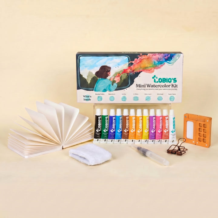
What You'll Need
- Watercolor Paper
- Pencil and eraser
- Two water cups
- Watercolors
- Round brush
Color Palette
If you’ve ever tried to paint a butterfly and ended up with muddy, overworked wings, forced symmetry, or a sad little blob with antennae, take a deep breath. You are in the right place.
While this is a tutorial for a classic butterfly watercolor painting, we are throwing rigid realism out the window. Instead, we are focusing on a "Loose Sketchbook Style." This method is fast, incredibly forgiving, and beginner-friendly. We aren't using masking fluid, we aren't painstakingly tracing perfect proportions, and we certainly aren't stressing over hyper-realistic details.
We are simply letting the water and pigment do what they do best: mingle beautifully.
If you want more projects like this after you finish, you can browse our full library of step-by-step lessons on Watercolor Tutorials.
The Color Palette for this Butterfly Watercolor Painting
Based on the warm, expressive study above, we are keeping our palette incredibly simple. Limiting your pigments is the secret to avoiding "mud."
- Alizarin Crimson: A rosy, slightly muted pinkish-red that forms the outer edges of the wings.
- Yellow Ochre: A warm, earthy, golden orange that creates the glowing center of the wings.
- Burnt Umber: A rich, dark brown used for the body, antennae, and those quick, expressive wing dashes.

The Pencil Whisper
With a very light hand, map out the basic shapes. Draw a small vertical dash for the body. For the upper wings, sketch two loose, rounded triangles.
For the lower wings, add two slightly scalloped shapes that droop downward. Do not worry about making the left and right sides identical, nature isn't perfectly symmetrical, and your sketchbook shouldn't be either.

The Wet-on-Wet Color Drop
Take your medium brush and paint the wing shapes with clean water, leaving a few tiny slivers of dry paper near the center to act as natural white highlights. While the paper is still shiny and wet, drop Yellow Ochre near the center (closest to the body). Then, load your brush with Alizarin Crimson and tap it along the outer edges of the wings.
Let the two colors pull toward each other and blend on their own.
Hands off! Let it dry until the intense shine is just starting to fade.

The Imperfect Body
While the wings are just barely damp (or totally dry, if you prefer less bleeding), pick up your small brush loaded with concentrated Burnt Umber. Paint the simple oval shape of the body in the center. If it bleeds a tiny bit into the wet wings, celebrate it, that’s the hallmark of a loose watercolor style!

Expressive Veins and Details
Wait until the wings are completely dry. Using the very tip of your small brush and your Burnt Umber, it's time to add character.
Do not paint continuous, hard lines. Instead, use quick, disconnected dashes and sweeping flicks to suggest the veins and the textured outer edges of the wings.
Finally, flick two quick, elegant antennae extending upward from the head.
The "Walk Away"
Now for the hardest part: resist the urge to fiddle.
The true magic of an expressive watercolor butterfly lies in those unpredictable watermarks and messy, natural bleeds.
Drop your brush, step back, and let it dry completely.
Style Variations for Your Butterfly Watercolor Painting
Want to change the vibe of your expressive sketchbook butterfly?
Try these quick adaptations to mix things up:
The "Moody Moth" (Dramatic & Heavy)
- Cool the palette: Swap your warm Alizarin Crimson and Yellow Ochre for deep, moody blues like Indigo or a rich Payne’s Gray mixed with your brown.
- Deepen the shadows: Paint the inner crevices near the body much darker, leaving only a tiny sliver of pale moonlight on the very tips of the wings.
- Lost edges: Let the bottom edges of the lower wings bleed entirely into a dark, heavy background wash to anchor the moth in the night sky.
The "Sunlit Skipper" (The Delicate, Translucent Phase)
- Lighten the palette: Stick to highly watered-down Yellow Ochre and the palest wash of pink.
- Change the proportions: Soften any jagged wing edges so they sit as soft, rounded, gentle ovals.
- The "Fresh" Texture: Skip the heavy, crunchy Burnt Umber dashes. Keep the washes light, smooth, and translucent for a fresh, gossamer look.
The "Storybook Flutter" (Simplified for Cards & Patterns)
- Exaggerate shapes: Push the shape language into perfectly stylized, geometric blocks or distinct, exaggerated scallops along the wing edges.
- Bring back the speckles: Lean into the illustrative vibe by flicking a few perfect, deliberate splatters of contrasting paint over the dry wings for a playful texture.
- Flat color: Skip the messy wet-on-wet watermarks entirely. Use flat, highly-pigmented, graphic washes of solid color.
Inspiration: Why This Loose Style Works
This loose, expressive sketchbook approach to a butterfly watercolor painting is perfect for:
- Nature Journals and Garden Logs:
Capture the beautiful pollinators you spotted fluttering through your garden without needing a macro lens or a degree in entomology. You don’t need to paint every single microscopic wing scale; you just need that vibrant, airy silhouette to bring the memory back to life on the page. - Botanical & Spring Decor:
Because butterflies are naturally uplifting and organic, a soft, loose study looks timeless in a nursery, sunroom, or cozy reading nook. Frame a trio of these quick studies (perhaps paired with a sprig of pressed lavender or a dried leaf) for instant, nature-inspired wall art that feels genuinely personal and completely unique.
Frequently Asked Questions
Can I use regular drawing paper for this butterfly watercolor painting?
Honestly, no. To get those beautiful, effortless watercolor bleeds without your page warping into a crunchy potato chip, you really need 140 lb / 300 gsm watercolor paper. It does the heavy lifting for you!
My colors blended into a giant puddle. Is my painting ruined?
Not at all! That is the magic of the wet-on-wet technique. Because we are using a limited, harmonious color palette (Alizarin Crimson and Yellow Ochre), your puddle won't turn into brown mud. Embrace the organic bleeds, they dry beautifully. Just remember "The Walk Away" rule and don't over-brush it!
How do I add hyper-realistic wing patterns and microscopic veins?
You don't! The whole goal of an expressive 20-minute sketchbook study is to capture the energy and lightness of the butterfly, not its exact anatomy. Stick to a few quick, disconnected dashes of Burnt Umber for the edges, and let the viewer's imagination fill in the rest.
Conclusion
A great butterfly watercolor painting is mostly two things: simple shapes and patience between layers. Try the loose Monarch first, then the Blue Morpho for those satisfying gradients. Once you’re comfortable, add flowers, play with salt texture, or go bold with splatter.
Want more step-by-step help that stays beginner-friendly? Visit Tobio’s Watercolor Tutorials or explore more creative projects on the Tobio’s Kits website.
Mel, Founder
Ready to Paint?
This tutorial was designed for use with our Watercolor Kit.
Link to the link


