


Garden Watercolor Painting: Step-by-Step Tutorial

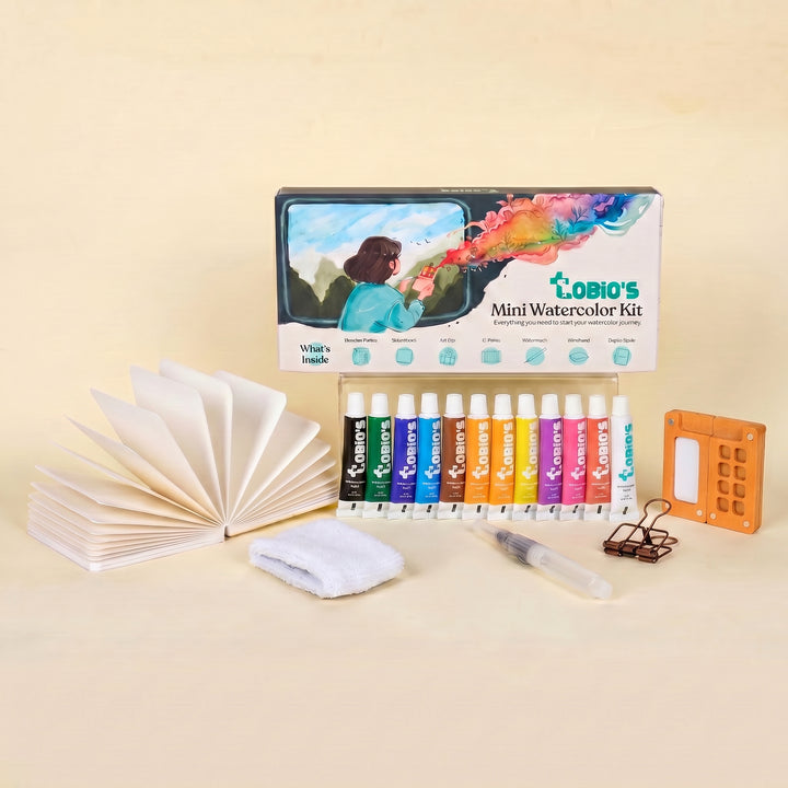
What You'll Need
- Watercolor Paper
- Pencil and eraser
- Two water cups
- Watercolors
- Round brush
Color Palette
If you’ve ever tried to paint a garden and ended up with a stiff, highly-engineered wall of green that looks more like a plastic hedge than a living ecosystem, you’re not alone. Real gardens are chaotic and wild. When we try to tightly control every leaf and petal, the life instantly drains out of the piece.
The good news? The best way to capture a garden's energy is to stop fussing. Forget the masking tape, ditch the complex tracing templates, and put down the tiny detail brushes. Today, we are focusing on a loose sketchbook style. This approach to garden watercolor painting is incredibly fast, highly forgiving, and perfect for beginners who just want to play with color.
If you want more projects like this after you finish, you can browse our full library of step-by-step lessons on Watercolor Tutorials.
The "Loose Style" Color Palette for Garden Watercolor Painting
You don't need a massive studio setup for this. You just need a decent sketchbook filled with 140lb / 300gsm watercolor paper (this does all the heavy lifting) and a few reliable pigments.
Based strictly on the watercolor painting in our study, here are the specific colors we are pulling out for this vibrant scene:
- Raw Sienna: For that warm, sandy, sun-baked garden path.
- Sap Green: The ultimate, vibrant workhorse for our sunlit bushes and grassy borders.
- Dark Green: For anchoring the foreground and creating deep, cool shadows.
- Alizarin Crimson: For those expressive, warm pink and red floral pops.
- Lemon Yellow: For bright, punchy dabs of wildflowers.
- Ultramarine Blue: For the cool-toned blue blossoms and the light sky wash.

The Sky and the Sweeping Path
Start with a very light, watery wash of Ultramarine Blue at the top for the sky. Before it dries, grab a light wash of your Raw Sienna and sweep a loose, curved "S" shape right down the middle of your page to create the garden path.
Leave some white space, it adds a beautiful sparkle.

Blocking in the Wild Greenery
While the paper is still slightly damp, load up your brush with Sap Green. Dab and drop the color in to create the fluffy tree lines and bushes in the background. Don't paint individual leaves; paint shapes.
Drop a little Dark Green into the wet areas near the base of the bushes to instantly create deep shadows without lifting a finger.

The Floral Confetti
Here is where the magic happens. Along the edges of your path, use thick, juicy pigment straight from the pan (less water, more color). Dab in little clusters of Lemon Yellow, Alizarin Crimson, and Ultramarine Blue.
Let them sit right on top of the greens, and if they bleed a tiny bit into the damp background, celebrate it!
That’s the loose style doing its job.

Grounding the Foreground
Once the piece is mostly dry, take a thicker mix of Dark Green and flick your brush a few times at the very bottom corners. These quick, upward strokes suggest grass blades and anchor the viewer into the scene.
The "Walk Away"
Resist the urge to fiddle or "fix" messy puddles.
The true charm of an expressive garden watercolor painting lies in those unpredictable watermarks and natural bleeds.
Drop your brush and let it dry completely.
Style Variations for Your Garden Watercolor Painting
Want to change the vibe of your expressive garden watercolor painting?
Try these quick sketchbook adaptations using the same basic techniques:
The "Moody Midnight Garden" (Dramatic & Heavy)
- Cool the palette: Swap your warm, bright yellows for deep, moody blues like extra Ultramarine or a touch of Payne’s Gray mixed into your Dark Green.
- Deepen the shadows: Paint the bottom crevices of the bushes much darker, leaving only a tiny sliver of pale moonlight on the very top of the foliage.
- Lost edges: Let the bottom of the lowest leafy clusters bleed entirely into a dark, heavy ground wash to anchor them in the evening shadows.
The "Sunlit Spring Border" (The Soft, Gentle Phase)
- Lighten the palette: Stick to highly watered-down Lemon Yellow and the palest washes of Sap Green.
- Change the proportions: Soften the jagged, wild edges so the bushes sit as soft, rounded, water-polished clouds of foliage.
- The "Fresh" Texture: Skip the heavy, deep green shadows. Keep the washes light, smooth, and translucent for a fresh, early-morning look.
The "Storybook Cottage Path" (Simplified for Cards & Patterns)
- Exaggerate shapes: Push the shape language into perfectly stacked, geometric blocks of flowers or distinct, stylized triangles for the background trees.
- Bring back the speckles: Lean into the illustrative vibe by flicking a few perfect, deliberate splatters of Alizarin Crimson and Lemon Yellow over the dry greens for a stylized floral texture.
- Flat color: Skip the messy watermarks. Use flat, highly-pigmented, graphic washes of solid color for a modern, punchy look.
Inspiration: Why This Loose Style Works
This loose, expressive sketchbook approach to a garden watercolor painting is perfect for:
Nature Journals and Garden Logs:
Capture the wild floral borders you spotted on a neighborhood walk without needing a macro lens or a botany degree. You don’t need to paint every single petal fracture or leaf vein; you just need that chunky, colorful silhouette to bring the sunny memory back to life.
Bright & Botanical Decor:
Because blooming gardens are naturally joyful and organic, a soft, loose study looks timeless in a sunroom or cozy reading nook. Frame a trio of these vibrant path scenes (perhaps adding a real pressed flower or a sprig of dried lavender in the frame) for instant, nature-inspired wall art that doesn't feel stiff, stuffy, or "store-bought."
Frequently Asked Questions
Do I need to draw every detail before starting a garden watercolor painting?
Absolutely not! Skipping the detailed sketch is the secret to this loose style. Just lightly draw your garden path, then let your brush and the water do the heavy lifting for the flowers and leaves.
How do I stop my greens from getting muddy?
Mud happens when you overmix or scrub damp paint. Stick to a simple palette like Sap Green and Dark Green, let them blend naturally right on the paper, and practice the "Walk Away" step. Once the paint is down, leave it alone!
What paper is best for a quick garden watercolor painting?
The paper does 90% of the work! Always use 140lb / 300gsm watercolor paper. It’s thick enough to handle juicy, wet-on-wet washes without warping into a frustrating, wrinkly taco.
Conclusion
Garden watercolor painting gets easier when you stop trying to paint every leaf and instead focus on big shapes, clean layers, and a few believable green mixes. Use wet-on-wet for soft garden atmosphere, glazing for depth, and negative painting to make leaf clusters read clearly.
Pick one of the three projects above, set a timer, and paint a quick version today. You’ll learn more from two fast gardens than one slow, overworked one.
Mel, Founder
Ready to Paint?
This tutorial was designed for use with our Watercolor Kit.
Link to the link


