


Heart Watercolor Painting: Step-by-Step Tutorial

What You'll Need
- Paper
- Brushes
- Paint colors
- Palette
- Water cup
- Pencil
Color Palette
Let's address the elephant in the room: Perfect hearts are boring.
If you want a geometrically perfect heart, use a stencil. But if you want a heart watercolor painting that feels alive, pulsing, and a little bit romantic, you need to let the water do the work.
Today, we are doing a loose sketchbook study. This isn't about staying inside the lines. It's about capturing the volume of the heart, making it look like a rounded, shiny gemstone rather than a flat sticker. This method is fast (under 15 minutes) and uses a "wet edge" technique to create a beautiful, natural gradient.
The Supplies (Keep it Simple)
- Paper: 140lb/300gsm Cold Press paper. (We need texture to hold the wash).
- Brush: A Size 6 or 8 Round Brush.
- Paints: See the palette below.
- Extras: Water, paper towel, and a pencil.
The Color Palette
Based on the sketchbook study above, we are using a rich, monochromatic red palette. The drama comes from the value change (light to dark), not from using a dozen different colors.
- Alizarin Crimson: A cool, deep red for the shadows.
- Cadmium Red: A warm, punchy red for the mid-tones.
- Burnt Umber: A tiny touch to deepen the darkest crevices.
Step-by-Step: Your Expressive Heart Watercolor Painting
The secret to this 3D look is the highlight. We are going to paint around the light, leaving the white paper untouched. In watercolor, the paper itself is your brightest white, so once you cover it up, you lose that brilliant, natural glow forever. We need to map out those shiny reflections first and protect them like they are precious gems before we splash on the red.

The "Balloon" Sketch
Don't draw a pointy, stiff heart.
Sketch a rounded, plump heart shape. Think of it like a balloon that's fully inflated.
The Shine: Lightly circle two small oval shapes on the upper left curve of the heart. Do not paint inside these ovals. These are your highlights.

The First Juicy Wash
Load your brush with a watery mix of Cadmium Red.
- Paint the entire heart except for those two little oval highlights.
- Work quickly! You want the paint to stay wet.
- The edges don't need to be razor-sharp. A little wobble adds character.

Deepening the Shadow (Wet-on-Wet)
While the red paint is still damp and shiny:
- Pick up some thick Alizarin Crimson (creamy consistency, not watery).
- Drop this dark red into the edges of the heart, specifically the bottom point and the top divot.
- Watch it bleed. Let the dark red swirl into the lighter red. Tilt your paper slightly if you want to help it move.

The Core Shadow & The Cast Shadow
Now, let's make it look round.
- Mix a tiny bit of Burnt Umber into your Alizarin Crimson.
- Paint a curved shadow shape along the bottom right side of the heart.
- This dark curve pushes the lighter center of the heart forward, making it look 3D.
To stop the heart from floating in space:
- dilute your dirty red/brown mix with lots of water.
- Paint a soft, blurry shadow underneath the heart, following the "V" shape.
- Let this shadow fade out into the white paper.
Troubleshooting: Fix Common Heart Painting Problems
My heart looks streaky
Cause: your paper dried mid-blend or your brush was too dry.
Fix: work faster, keep a wet edge, and use a clean damp brush to soften transitions.
My colors turned muddy
Cause: too many pigments mixed together, or you kept scrubbing the same area.
Fix: limit each heart to two main colors, and let layers dry before glazing.
Paint bled outside my outline
Cause: overloaded brush or water sitting outside the line.
Fix: keep the outside edge dry, use a damp brush (not dripping), and lift mistakes quickly with a clean brush.
Frequently Asked Questions
Can I use white paint for the highlights instead of leaving the paper blank?
You can, but it won't look as bright. In a heart watercolor painting, the white of the paper is the brightest "light" you have. White paint (gouache or Chinese White) often looks chalky or milky on top of red. Leaving the paper bare gives you that crisp, wet, shiny look.
Why does the tutorial use two different reds?
To create dimension! Cadmium Red is a "warm" red (orangey), which pops forward and looks like sunlight. Alizarin Crimson is a "cool" red (purplish), which recedes and looks like shadow. Using both makes the heart look round and 3D without you having to do any complicated shading.
My shadow color turned the heart brown. What happened?
You likely scrubbed the paint too much. When adding the Burnt Umber mix to the bottom, just drop it in and let it sit. If you keep brushing it back and forth into the bright red, you’ll mix a muddy soup. Trust the water to move the paint for you.
Do I have to draw the "balloon" shape?
No, but it helps! A classic, sharp-pointed heart often looks flat, like a sticker. Drawing a rounded, chubby "balloon" shape gives you more room to play with the wet-on-wet bleeds and makes the final painting look juicier.
Conclusion
A great heart watercolor painting is mostly water control and timing. Pick a simple palette, use thicker paper, and choose one technique you can repeat. If you want more structured, follow-along practice (without guessing what to do next), head to Tobio’s Kits’ watercolor tutorials and keep building your skills one satisfying project at a time. When you’re ready to set yourself up for consistent wins, explore Tobio’s Kits for an easier path from “messy blob” to “actually frameable.”
Mel, Founder
Ready to Paint?
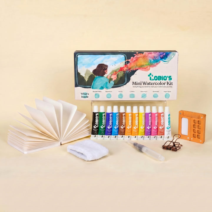
This tutorial was designed for use with our Watercolor Kit.
Shop the Kit


