
Japanese Watercolor Painting: Step-by-Step Tutorial

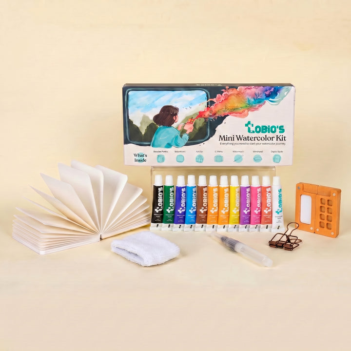
What You'll Need
- Paper
- Brushes
- Paint colors
- Palette
- Water cup
- Pencil
Color Palette
Traditional Sumi-e masters spend decades perfecting a single brush stroke.
We are not doing that today.
We are doing a loose, expressive sketchbook study. We are capturing the iconic vibe of a japanese watercolor painting, Mount Fuji, a tiered pagoda, and drifting cherry blossoms, without worrying about architectural precision. This is about capturing the "spirit" of the landscape in under 25 minutes. So put away your ruler and stop holding your breath. If your pagoda leans a little to the left, we’ll just call it wabi-sabi (the beauty of imperfection) and keep painting. We want the calm energy of the mountain, not the stress of an architectural blueprint.
The Supplies (Keep it Simple)
- Paper: 140lb/300gsm Cold Press paper. (Texture helps the mountain look rocky).
- Brush: A Size 6 or 8 Round Brush. (One brush can do it all).
- Paints: See the palette below.
- Extras: Water, paper towel, and a sense of calm.
The Color Palette
Based on the sketchbook study above, we are using a traditional, harmonious palette. We want the cool blue of the mountain to contrast with the warm red of the pagoda.
- Cobalt Blue: A cool, airy blue for Mt. Fuji.
- Permanent Rose: For the soft cherry blossoms.
- Vermilion (or Cadmium Red): A bright, orangey-red for the pagoda.
- Ivory Black: For the pagoda roofs (use sparingly!).
- Burnt Umber: For the tree branches.
Core Techniques: Water Control, Edges, and Expressive Marks
The “Japanese look” is mostly technique, not secret pigments. Here are the building blocks that matter most.
1) Moisture control: the real skill
Watercolor is basically a negotiation between wet paint, wet paper, and your patience. For Japanese-inspired work, you want fewer accidental blooms and more intentional gradients.
- Damp paper gives soft edges with control.
- Wet paper gives big, spreading shapes that can look gorgeous, or chaotic if you keep poking them.
- Dry paper gives crisp edges and clean shapes.
Rule you’ll thank later: if something looks good, stop touching it.
2) Bokashi-style gradients (soft fade)
This is your go-to for gentle skies, mist, or a soft wash behind a subject.
- Pre-wet a small area with clean water (not a puddle, just a sheen).
- Drop in pigment on one side.
- Rinse your brush, blot it slightly, then pull the edge outward to fade.
Step-by-Step: Your Expressive Japanese Watercolor Painting
The trick here is layering. We paint the background (mountain) first, then the middle ground (pagoda), and finally the foreground (branches). By working back-to-front, we create instant depth without needing complicated perspective rules. Plus, it gives you a chance to breathe (and let the paper dry) between each iconic element.

The Mountain (Negative Space is Key)
Mt. Fuji is famous for its snow cap. We aren't painting the snow; we are painting around it.
- Load your brush with watery Cobalt Blue.
- Paint a broad, swooping triangle shape.
- The Trick: Leave the top triangle completely white. Use the tip of your brush to make the edge of the blue "jagged" so it looks like snow resting on rock.
- Let the blue fade out at the bottom with a little extra water to create a misty look.

The Pagoda (Stacks of Red)
While the mountain dries, move to the right side of the paper.
- Using Vermilion, paint 3 or 4 small horizontal rectangles, stacked on top of each other with space in between. These are the floors of the pagoda.
- Switch to Ivory Black (thick, not watery). Paint curved, swooping lines on top of each red rectangle for the roofs. Add a little spire on top.
- Don't worry if the lines aren't straight. It’s an old building; it’s allowed to be a little wobbly.

The Cherry Blossoms (The "Dance")
Now for the foreground.
- Mix a watery Permanent Rose.
- Dab your brush randomly in the corners of the page (top right and bottom left).
- Don't paint flowers. Just paint blobs. Vary the pressure to make some petals big and some small.
- Let them float. They don't all need to be attached to a branch.

The Branches (Connecting the Dots)
Anchor the flowers.
- Mix Burnt Umber with a tiny touch of Black.
- Paint quick, jagged lines connecting your pink blobs.
- Artist Tip: Japanese cherry branches are angular, not noodly. Use quick, jerky strokes to give them that "snap."
- If a branch crosses in front of the mountain or pagoda, that’s great, it adds depth.
Frequently Asked Questions
Do I need special rice paper for a Japanese watercolor painting?
Not for this specific study. Traditional Sumi-e is often done on absorbent rice paper (washi), but for this 25-minute sketchbook study, we used standard 140lb Cold Press paper. The texture of the Cold Press paper actually helps create that rocky, snow-capped effect on Mount Fuji without you having to do any extra work.
My pagoda looks like it's falling over.
Perfect. In Japanese aesthetics, there is a concept called wabi-sabi, which finds beauty in imperfection. A ruler-straight pagoda looks like a technical blueprint. A slightly wobbly, hand-painted pagoda looks like it has history and character. Embrace the wobble!
Why is the mountain blue? Shouldn't it be gray or green?
We use Cobalt Blue to create "atmospheric perspective." Things that are very far away (like a giant mountain) appear blue because of the atmosphere between you and them. By painting the mountain cool blue and the pagoda warm red, you force the mountain into the background, creating instant depth.
Should I paint individual petals for the cherry blossoms?
No. If you paint every single petal, your tree will look stiff and cluttered. We want to capture the impression of a blooming tree. From a distance, cherry blossoms look like soft pink clouds, so painting loose "blobs" is actually more realistic than painting perfect little flowers.
Conclusion
Japanese watercolor style isn’t about perfect detail. It’s about traditional restraint: fewer colors, cleaner edges, intentional negative space, and marks that look like you meant them (because you did).
Paint the branch once, then paint it again with one change: a different angle, fewer leaves, a softer wash, a bolder dark. That repetition is where the style starts to feel natural.
When you’re ready to keep going with guided projects, head to the Tobio’s Kits homepage and pick a kit or tutorial that matches the calm, minimal look you’re aiming for.
Mel, Founder
Ready to Paint?
This tutorial was designed for use with our Watercolor Kit.
Shop the Kit


