


Ocean Watercolor Painting: Step-by-Step Tutorial

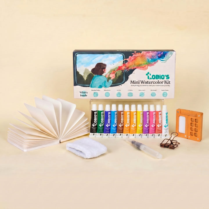
What You'll Need
- Watercolor Paper
- Pencil and eraser
- Two water cups
- Watercolors
- Round brush
Color Palette
Let’s be honest: sometimes you don’t have three hours to tape down a full sheet of Arches paper and painstakingly mask out foam. Sometimes, you just want to clip a tiny palette to your sketchbook, sit on the floor (or a beach chair, if you're lucky), and capture the vibe of the sea.
This tutorial is a departure from stiff, technical diagrams. We are focusing on the "Loose Sketchbook Style" the kind you see in the image above. It’s imperfect, it’s expressive, and it captures the movement of the water without worrying about every single droplet.
If you want more projects like this after you finish, you can browse our full library of step-by-step lessons on Watercolor Tutorials.
The "Micro-Palette" Color Strategy
Looking at our reference photo, you can see this isn't about having 40 colors. It's about having the right three. To get that deep, rolling Atlantic look, we are using specific pigments that interact beautifully on the paper.
Here is the trio you need (names used by brands like Winsor & Newton or Daniel Smith):
- Phthalo Blue (Green Shade): This is your powerhouse. It’s intense, transparent, and creates that deep "middle ocean" color.
- Cobalt Turquoise: Look at the lighter washes in the image, that’s this color. It gives you that tropical, near-shore glow.
- Indigo: For the deepest shadows and the sharp lines under the waves.
The Paper Matters: Even for a quick sketch, use 140lb (300gsm) Cold Press paper. The texture (tooth) of cold press paper catches the pigment, doing 50% of the work for you by creating natural-looking "sparkles" on the water.

The "barely there" Sky
Dip your brush in clean water and pick up the tiniest amount of Phthalo Blue. You want this to be 90% water. Drag a simple wash across the top 1/3 of your page. Don't overwork it, let it be a little uneven.
That’s what clouds look like, anyway.

The Horizon Line
While the sky is drying (or just damp), mix a stronger concentration of Phthalo Blue and Cobalt Turquoise. Draw a straight line across the paper. This anchors your viewer. In the photo, you’ll see the horizon isn’t perfectly straight or ruler-sharp, it has a little organic wobble. That’s fine.

The Main Body (The Gradient)
Load your brush with Cobalt Turquoise and a touch of the Blue. Start just below your horizon line and pull the paint down. As you move toward the bottom of the page (the foreground), add more pigment and less water.
You want the bottom of the page to feel heavier and closer to you.

The "Dancing" Waves
This is the secret to the style in the photo. Switch to Indigo or a thick mix of Phthalo Blue.
Using the tip of your round brush, paint jagged, horizontal "wiggles" across the water.
- Important: Leave gaps! Look at the white spaces in the reference image. Those white gaps are the foam. Do not paint the foam; paint around it.
- Make the strokes thicker and wider at the bottom, and thinner near the horizon.
The "Walk Away"
To finish, take pure Indigo (very little water). Add tiny, dark accents right underneath the white paper gaps you left in Step 4.
This shadow makes the white paper look like bright, crashing foam.
Now, put the brush down.
Seriously. Stop touching it.
The "loose" look only works if you don't fiddle with it. If you go back in to "fix" a wave, you will turn it into mud.
Take It Further: Pro Tips & Style Variations
Pro tips that instantly improve results
- Save the whites: Your white "paint" is just the paper. Plan your foam highlights before you wet the brush.
- Squint at the horizon: Blur your eyes to see big shapes. Paint the broad bands of color, not individual droplets.
- Kill the "Neon" look: If your blue looks like a swimming pool, mix in a tiny touch of orange. It creates a rich, realistic ocean grey.
- Keep it flat: Use horizontal brushstrokes. Vertical strokes kill the illusion of depth immediately.
Style variations to try
- The "Misty Morning": Use wet-on-wet techniques for the whole page. Let the horizon line blur and disappear into fog.
- Graphic & Ink: Let the paint dry 100%, then use a waterproof pen to outline wave crests for a crisp, woodblock-print vibe.
- Mood Swings: Swap your palette. Use Indigo for a stormy Atlantic day, or Turquoise and Lemon Yellow for shallow tropical water.
Inspiration: Why This Style Works
This loose, expressive sketchbook approach to an ocean watercolor painting is perfect for:
- Travel Journals: Capture the coast before the tide changes. You don’t need to paint every single ripple; you just need that specific turquoise horizon to bring the vacation memory back.
- Instant Calm: Because looking at water lowers your heart rate. Frame this simple sketch for a friend (or yourself) who needs a "breath of fresh air" on a busy Tuesday. It feels far more personal, and expensive, than a store-bought print.
Frequently Asked Questions
1. Why does my ocean watercolor painting look flat?
You likely used the same color strength everywhere. Real water gets lighter near the horizon and darker closer to you. If you paint the whole page one uniform blue, it looks like a painted door, not a sea.
2. Do I need masking fluid for the white foam?
No. For this loose style, masking fluid looks too stiff and artificial. The "sparkle" in the reference image comes from skipping spots (negative space) and letting the rough paper texture break up the paint.
3. My sketchbook paper is buckling. Is it ruined?
No, it’s just wet! Even heavy paper waves slightly with a big wash. Use the binder clip shown in the photo to hold the page taut while it dries, or flatten the book under a heavy weight overnight.
Conclusion
A good ocean watercolor painting is not about painting every ripple. It is about smart layering, clean mixes, and a few well-placed dark accents that create depth. Keep it simple, let it dry between layers, and treat highlights like gold.
When you want more structured practice (the kind that actually fits into real life), explore current projects at Tobio’s Kits and build your skills with the step-by-step guides in the watercolor tutorials.
Mel, Founder
Ready to Paint?
This tutorial was designed for use with our Watercolor Kit.
Link to the link


