


Poppy Flower Watercolor Painting: Step-by-Step Tutorial

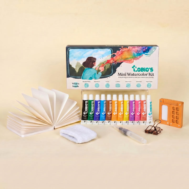
What You'll Need
- Watercolor Paper
- Pencil and eraser
- Two water cups
- Watercolors
- Round brush
Color Palette
If you’ve ever tried painting florals and ended up with a stiff, overworked red blob that looks more like a distressed tomato, take a deep breath. You are in the right place.
While this is a tutorial for a poppy flower watercolor painting, we are completely ditching the professional tracing, the masking tape, and the hours of drying time. Instead, we are focusing on a Loose Sketchbook Style.
As you can see in the tiny, binder-clipped setup above, this approach is fast, highly expressive, and incredibly beginner-friendly.
It’s about capturing the feeling of a poppy on the page in 15 minutes or less.
If you want more projects like this after you finish, you can browse our full library of step-by-step lessons on Watercolor Tutorials.
The Expressive Poppy Color Palette
Based strictly on the dried pigments you see in the painted poppy above, here are the 5 specific colors you need. No massive studio setups required, just a tiny travel palette will do!
- Cadmium Red Light: The bright, warm, almost-orange base for the airy petals.
- Alizarin Crimson: A cooler, deeper red to drop into the damp petals for instant shadow and depth.
- Lemon Yellow: For those vibrant, punchy little stamen highlights glowing in the center.
- Ivory Black: The dark, high-contrast anchor for the middle of the flower.
- Sap Green: A natural, earthy green for that single, effortless stem.

The Juicy First Wash
Wet your brush and pick up a generous amount of your Cadmium Red Light. Paint 4 to 5 loose, overlapping petal shapes. Let the brush dance a little, crinkly, imperfect edges are exactly what you want. Leave a little white space breathing between a few petals; it keeps the painting fresh.

Drop in the Depth
While that first layer of red is still damp and shiny, pick up a little Alizarin Crimson. Lightly dab it near the center of the flower and let the watercolor do the heavy lifting. The darker paint will naturally bloom outward into the lighter red, creating beautiful, soft gradients without any extra blending work from you.

Anchor the Center
Once the red petals are almost dry (just barely damp), it’s time for the poppy's signature look. Dab your Ivory Black right into the center. Because the paper is still slightly damp, the edges of the black will soften just a bit, making the center look naturally embedded rather than pasted on. While you're there, dot in a little Lemon Yellow around the dark center to suggest the bright stamens.

The Single Stem
Load your brush with Sap Green. Starting from the bottom of the petals, pull a single, confident, slightly curved line down the page.
Walk Away
Now, this is the most important step:
Stop painting.
Step away from the sketchbook!
The beauty of this expressive style is its simplicity.
Watercolor rewards artists who know when to quit while they’re ahead.
Style Variations: Moody Bloom, Sunlit Petal, and Storybook Poppy
Want to completely change the vibe of your sketchbook floral?
You don't need a new technique, just a slight shift in your approach.
Try these quick, expressive adaptations:
The "Moody Poppy" (Dramatic & Heavy)
- Cool the palette: Swap out that bright, warm Cadmium Red for deep, moody crimsons and burgundies. Mix a little Indigo or an extra dose of Payne’s Gray right into your red to create heavy, bruised shadows.
- Deepen the shadows: Paint the base of the petals near the center much darker, leaving only a tiny, crisp sliver of pale paper to act as a harsh rim light on the very top edges of the flower.
- Lose your edges: Let the bottom or background petals bleed entirely into a dark, heavy shadow wash. Anchor the flower right into a moody, atmospheric background rather than leaving it floating on white paper.
The "Sunlit Petal" (Smooth & Gentle)
- Lighten the palette: Ditch the heavy pigments. Stick to highly watered-down warm reds and the absolute palest, translucent washes of peach or pink.
- Change the proportions: Soften those jagged, crinkly petal edges so the poppy sits as a flat, rounded, delicate cup shape.
- Keep it fresh: Skip the heavy, dark center and the crunchy shadows entirely. Keep your watercolor washes light, smooth, and highly translucent for a fresh, sun-bleached look.
The "Storybook Poppy" (Simplified & Illustrative)
- Exaggerate the shapes: Push the shape language! Turn the petals into perfectly stacked, geometric blocks or distinct, stylized, sweeping scallops.
- Bring on the speckles: Lean hard into the illustrative vibe. Once the petals are dry, flick a few deliberate, highly-pigmented splatters of red or black paint around the stem and flower for a stylized, playful texture.
- Go flat: Skip the messy watermarks and wet-on-wet blooms. Use flat, graphic washes of solid, unblended color for a bold, poster-like feel.
Inspiration: Why This Loose Style Works
This quick, expressive sketchbook approach to your poppy flower watercolor painting is perfect for a few specific reasons:
- Travel Journals and Nature Walks:
Capture the bright wildflowers you spotted on a weekend stroll without needing a botanical degree. You don’t need to paint every single microscopic petal vein; you just need that bold, airy silhouette to bring the memory back to life on the page. - Modern & Cozy Decor:
Poppies are naturally uplifting and add an instant, joyful pop of color. A soft, loose study looks incredibly fresh and timeless in a sunny kitchen or a cozy reading nook. Frame a trio of these vibrant florals for instant, nature-inspired wall art that feels intentional, artistic, and never "store-bought."
Frequently Asked Questions
Why did my poppy’s dark center turn into a muddy puddle?
You likely dropped the black in while the red petals were still too wet! Wait until the red wash is just barely damp, losing its shiny gloss, before tapping in the Ivory Black.
What should I do if I accidentally add too much water?
Don't panic! Just wipe your brush completely dry on your paper towel, and use the "thirsty" brush to gently soak up the excess water right off your paper.
Do I have to use these exact red paint colors?
Absolutely not! Use whatever reds, pinks, or warm oranges you already have in your palette. The magic of this loose style is in the airy shapes and confident brushstrokes, not the specific pigment names.
Conclusion
You don’t need perfection to make beautiful poppy flower watercolor painting. Keep the petals loose, let wet on wet do the heavy lifting, give the center enough contrast, and stop before you “fix” it into oblivion.
When you’re ready for your next lesson, head to the watercolor tutorials page and keep painting. Your future walls, sketchbooks, and gift piles will thank you.
Mel, Founder
Ready to Paint?
This tutorial was designed for use with our Watercolor Kit.
Link to the link


