


River Watercolor Painting: Step-by-Step Tutorial

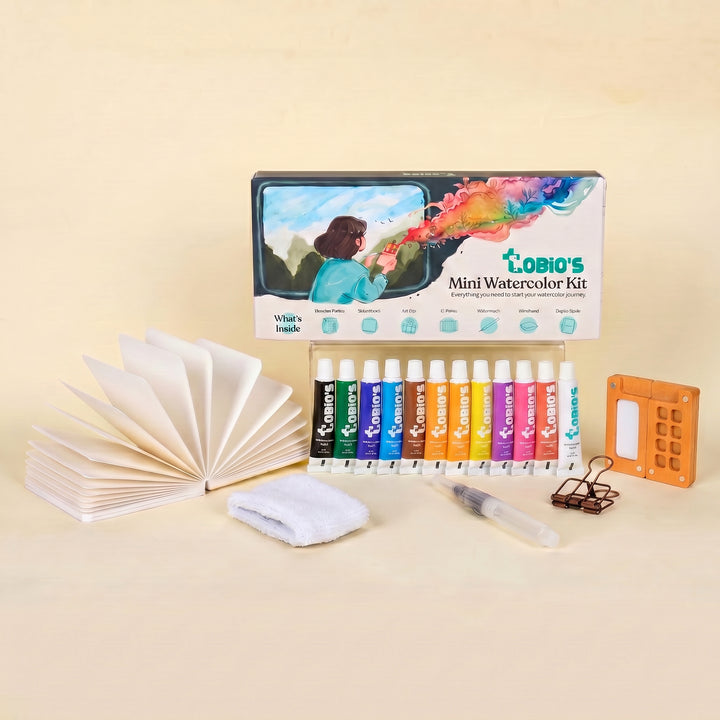
What You'll Need
- Watercolor Paper
- Pencil and eraser
- Two water cups
- Watercolors
- Round brush
Color Palette
Let’s be honest: painting water can be downright intimidating.
If your past attempts at a river watercolor painting ended up looking like a flat, suspiciously blue highway running through a green void, you are absolutely not alone!
While this is a step-by-step tutorial for a river watercolor painting, we are officially ditching the rigid rules today. Instead, we are focusing on a "Loose Sketchbook Style" that is fast, expressive, and wonderfully beginner-friendly. There is no masking tape to peel, no tedious tracing involved, and zero complex layering to stress over. Just you, your brush, and a fun 35-minute session of sweeping strokes on your favorite 140lb/300gsm watercolor paper.
If you want more projects like this after you finish, you can browse our full library of step-by-step lessons on Watercolor Tutorials.
The Color Palette for Our River Watercolor Painting
Forget the overwhelming mega-palettes that just tempt you into mixing mud. Based entirely on the vibrant, flowing painting in our sketchbook example, here are the 5 specific pigments we’ll be using to bring this scene to life:
- Ultramarine Blue: The workhorse for the deep, winding currents in the center of the river.
- Cerulean Blue: For the brighter, shallower ripples catching the light.
- Sap Green: The absolute MVP for those punchy, bright bushes and the grassy banks.
- Burnt Sienna: To give a warm, earthy structure to the scattered rocks lining the riverbed.
- Payne's Gray: For dropping quick, crisp shadows under the rocks and adding depth to the distant trees.

The Winding S-Curve Sketch
Grab your pencil and lightly map out the composition. Draw a simple S-curve for the river, making sure it’s wider at the bottom of the page (the foreground) and narrows as it winds back into the distance. Roughly outline where your clumps of bushes and the rocks along the riverbanks will sit.
Keep it light and breezy!

The Flowing River Wash
Time to paint the "mirror." Load your brush with Cerulean Blue and Ultramarine Blue. Instead of one flat wash, paint the river using long, sweeping, curved strokes that follow the S-shape of the banks.
Leave thin, expressive gaps of dry white paper between some of your blue strokes, these instantly become your natural water highlights and ripples without any extra effort!

Blocking the Banks and Rocks
While the river dries, switch to your Sap Green. Use loose, dabbing motions to paint the bushes and distant trees. Don't paint every single leaf; just block in the shapes. Next, take your Burnt Sienna and dab in the rocks sitting along the water's edge. Let the paint do the work, leaving some rough edges to suggest texture.

Crisp Details and Shadows
This is where the magic happens and the painting pops. Once everything is mostly dry, take a smaller brush with a mix of Payne's Gray and Sap Green to add deep shadows to the undersides of the bushes. Use Payne's Gray to carve out the bottom edges of the rocks where they meet the water.
Finally, use quick, upward flicks of Sap Green in the very front of your sketchbook page to create those expressive blades of grass.
The "Walk Away"
Now comes the hardest part: resist the urge to fiddle. You'll want to smooth out a bloom or "fix" a messy puddle, but don't. The true charm of an expressive river watercolor painting lies in those unpredictable watermarks and natural bleeds around your rocks and banks.
Drop your brush, step back, and let it dry completely.
Style Variations: Moody Riverbed, Sunlit Shallows, and Storybook Stream
Want to change the vibe of your river watercolor painting?
Try these quick sketchbook adaptations:
The "Moody Riverbed" (Dramatic & Heavy)
- Cool the palette: Swap the bright, cheerful greens for deep, moody mixes. Heavy your water up with pure Ultramarine Blue and extra Payne’s Gray.
- Deepen the shadows: Paint the crevices between your riverbank rocks much darker, leaving only a tiny sliver of pale, unpainted paper as rim light on the very top of the Burnt Sienna stones.
- Lost edges: Let the bottom of the lowest stones bleed entirely into a dark, heavy water wash to anchor them in wet mud and deep currents.
The "Sunlit Shallows" (The Smooth, Gentle Phase)
- Lighten the palette: Stick to highly watered-down Cerulean Blue for the water and the palest, airiest wash of Sap Green for the banks.
- Change the proportions: Soften the jagged edges of the riverbanks so the water flows over flat, rounded, water-polished ovals instead of chunky boulders.
- The "Fresh" Texture: Skip the heavy, crunchy Payne's Gray shadows entirely. Keep the washes light and smooth for a fresh, sparkling morning look.
The "Storybook Stream" (Simplified for Cards & Patterns)
- Exaggerate shapes: Push the shape language into perfectly curving, stylized ribbons for the water and distinct, almost geometric clumps for the bushes.
- Bring back the speckles: Lean into the illustrative vibe by flicking a few perfect, deliberate splatters of Sap Green or Cerulean paint over the dry paper for a playful, stylized texture.
- Flat color: Skip the messy, organic watermarks. Use flat, highly-pigmented, graphic washes of solid color.
Inspiration: Why This Style Works
This loose, expressive sketchbook approach to a river watercolor painting is perfect for:
- Travel Journals and Hiking Logs:
Capture the cool, winding streams you spotted on a mountain trail without needing a macro lens or a degree in fluid dynamics. You don’t need to paint every single ripple or leaf; you just need that sweeping S-curve, some earthy silhouettes, and a vibrant swoop of blue to bring the memory back. - Earthy & Nature-Inspired Decor:
Because flowing water and stones are naturally grounding and organic, a soft, loose river study looks timeless in a home office or cozy reading nook. Frame a trio of these quick studies (perhaps adding a sprig of dried grass or a tiny pressed leaf in the frame) for instant, customized wall art that doesn't feel "store-bought."
Frequently Asked Questions
Can I really paint a river in just 35 minutes?
Yes! This loose style skips the tedious masking fluid and tracing. We just lay down a sweeping S-curve, block in the main colors, and let the wet paint do the heavy lifting.
Why isn't there any black paint in this tutorial?
Pure black straight from the pan can make a river watercolor painting look heavy and flat. We use Payne's Gray instead, it gives you crisp, deep shadows under your rocks and bushes while keeping the scene airy and vibrant.
My water wash dried with weird puddles. How do I fix it?
You don't! In an expressive sketchbook study, unpredictable watermarks and blooms are a feature, not a bug. Resist the urge to scrub at damp paper, let it dry, and embrace the beautiful chaos.
Conclusion
A solid river watercolor painting comes down to a few unglamorous wins: simplify the scene, nail the big value shapes, keep water strokes mostly horizontal, and treat reflections like softened echoes. Do that, and your river stops looking like a painted shape and starts looking like actual water.
If you want more guided practice and a smoother learning curve, explore Tobio’s Kits and keep practicing one river study at a time. Your future paintings will thank you.
Mel, Founder
Ready to Paint?
This tutorial was designed for use with our Watercolor Kit.
Link to the link


