


Rose Watercolor Painting: Step-by-Step Tutorial

What You'll Need
- Paper
- Brushes
- Paint colors
- Palette
- Water cup
- Pencil
Color Palette
A lot of tutorials will tell you to draw a perfect spiral or trace a complex botanical diagram. That is a recipe for a stiff, anxious painting.
Today, we are doing a loose sketchbook study. We are going to build a rose watercolor painting using organic, C-shaped strokes and letting the water do the blending for us. This method is fast, expressive, and captures the feeling of a blooming rose without getting bogged down in petal counts.
The Supplies (Keep it Simple)
- Paper: 140lb/300gsm Cold Press paper. (Texture helps the rose look organic).
- Brush: A Size 6 or 8 Round Brush (big enough for juicy petals, small enough for details).
- Paints: See our "Vintage Romance" palette below.
The Color Palette
Based on the sketchbook study above, we are using a deep, moody palette that feels classic and rich.
- Alizarin Crimson (or a deep cool Red): The star of the show.
- Sap Green: For the stem and leaves.
- Payne's Gray: Mixed with red to create the deep burgundy shadows.
- Burnt Sienna: A tiny touch to warm up the green leaves.
Step-by-Step: Your Expressive Rose Watercolor Painting
The secret to this rose is the "Tight to Loose" rhythm. The center of a rose is a tight knot of petals, while the outer petals are large, open, and relaxed. You want to start with nervous, twitchy little marks in the middle and then exhale as you move outward, letting your brush sweep in big, juicy curves. This contrast is what creates the illusion of a flower unfolding, rather than just a flat red circle. If you are looking for the right supplies to get this specific flow and texture, you can browse our full collection of kits to find the exact paper and paints we use for these studies.

The Tight Center
- Load your brush with a thick, creamy mix of Alizarin Crimson.
- Paint a few small, broken marks in the center. Think of them like tiny commas or brackets.
- Don't make a solid blob. Leave tiny white spaces between your marks. This white paper is the light hitting the petal edges.

The Middle Unfurling & The Outer Bloom
- Rinse your brush slightly so the red is a bit lighter/waterier.
- Paint larger "C" shapes around your center cluster.
- Overlap them slightly, but keep leaving those tiny white gaps. This is what separates the petals for you so you don't have to draw outlines later.
- Rinse your brush again. Now you want a very juicy, watery pink.
- Paint big, sweeping semi-circles for the outer petals.
- Let these petals touch the wet inner ones. Watch the dark red from the center bleed outward into the pale pink edges. That gradient is pure watercolor magic.

The Stem and Leaves & The Deep Shadows
- Mix Sap Green with a touch of Burnt Sienna for a natural, earthy green.
- Paint the stem with a slightly shaky line (thorns).
- Add two or three leaves.
- Artist Tip: Leave a tiny white gap where the green stem meets the red flower. This prevents the colors from mixing into a muddy brown mess.
While the flower is still damp (not soaking wet), mix Alizarin Crimson with a tiny bit of Payne's Gray to make a deep burgundy. - Touch this dark color into the very center of the rose and the bottom curves of the bowl.
- This high contrast makes the flower pop off the page.
Color Recipes: Red, Yellow, and Dusty Roses (Plus Leaves)
You can paint a whole garden with a tiny palette. Here are reliable mixes you can adapt to whatever brand you own.
Red rose watercolor painting
- Base: permanent rose (or a cool red) plus lots of water.
- Shadows: base mix plus a tiny touch of ultramarine or neutral tint.
Yellow rose watercolor painting
- Base: warm yellow heavily diluted.
- Shadows: warm yellow plus a tiny touch of rose (for warmth) or ultramarine (to neutralize).
- Keep it clean: rinse your brush often. Yellow shows mud faster than red.
Coral rose
- Base: rose red plus a little warm yellow.
- Shadows: same mix plus a tiny touch of neutral tint.
Dusty or antique rose
- Base: rose red plus a hint of burnt sienna or neutral tint.
- Shadows: add a touch more neutral tint to mute further.
Leaf greens that don’t scream “plastic”
- Base green: yellow plus blue (adjust for warm or cool).
- Shadow green: base green plus a tiny touch of rose/red to dull it.
Frequently Asked Questions
How do I stop my rose from looking like a red cabbage?
The "cabbage effect" happens when your strokes are too uniform. Vary your shapes! Small and tight in the middle, huge and loose on the outside. And remember the white space, if you lose the white gaps, you lose the petals.
My red and green turned into mud where they touched.
That's why the "white gap" in Step 5 is crucial! Red and Green are opposites on the color wheel, so they neutralize each other into brown. Keep them separated by a hair's breadth of dry paper.
Can I use a hairdryer to speed this up?
Better not. The beauty of this rose comes from the natural way the pigment settles into the water. A hairdryer blows the pigment around and ruins those soft, natural gradients.
Do I need a reference photo?
Not really. Once you learn the rhythm (tight center, loose outside), you can paint roses from imagination. The "C-stroke" method relies on muscle memory, not observation.
Conclusion
Great roses come from boring fundamentals: petal strokes, water control, and shadows that make overlaps believable. Use the quick loose method when you want speed and softness, and the botanical glazing method when you want structure and depth. Either way, you’re building a skill you can reuse for bouquets, wreaths, cards, and anything floral.
When you’re ready for your next project, explore Tobio’s watercolor tutorials or browse Tobio’s Kits for curated, beginner-friendly painting experiences that keep the process fun (and the supply list blessedly short).
Mel, Founder
Ready to Paint?
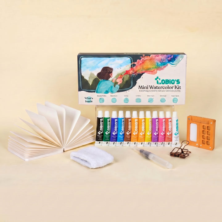
This tutorial was designed for use with our Watercolor Kit.
Shop the Kit


