


Watercolor House Painting: Step-by-Step Tutorial

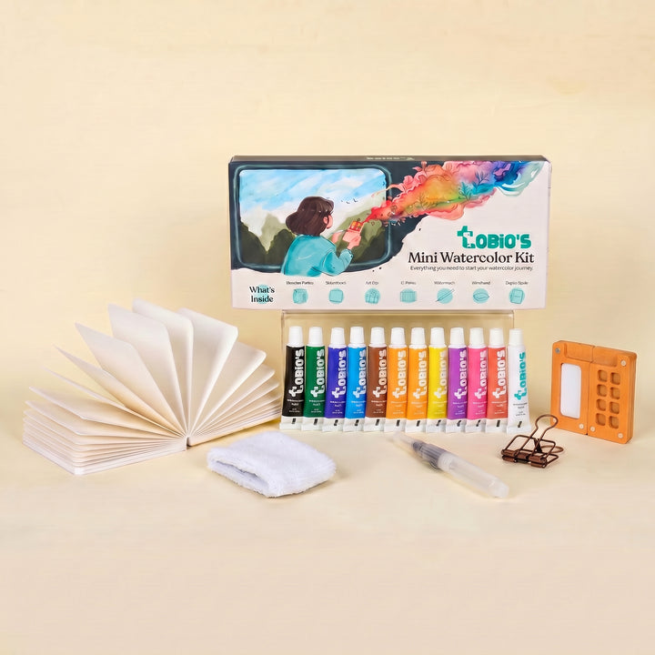
What You'll Need
- Watercolor Paper
- Pencil and eraser
- Two water cups
- Watercolors
- Round brush
Color Palette
Let’s be honest: if you wanted a blueprint, you’d hire an architect. But you’re here to paint.
If you’ve ever tried a watercolor house painting and stressed over perfectly straight ruler lines or windows that didn't match up, this tutorial is your permission slip to stop. The image above isn't a technical drafting project; it’s a sketch. It’s charming because it’s imperfect.
This guide focuses on the "Loose Sketchbook Style." It’s fast, it’s portable, and it captures the feeling of a home rather than the geometry of it.
If you want more projects like this after you finish, you can browse our full library of step-by-step lessons on Watercolor Tutorials.
The "Rustic Earth" Color Palette
Looking at our reference study, we aren't using a rainbow. We are using a sophisticated, limited trio of earth tones. Limiting your colors creates instant harmony.
- Raw Sienna: This is that warm, toasted-bread color used for the light washes on the walls.
- Burnt Sienna: The rich, reddish-brown powerhouse used for the roof structure and timber framing.
- Payne’s Gray: The deep, moody blue-black used for the windows and high-contrast shadows.
Quick Start: Supplies & Setup
You don’t need a studio for this. As you can see in the photo, a simple travel clip-on palette works wonders.
- Paper: This is the one place we don't skimp. Use 140lb (300gsm) watercolor paper. The sketchbook in the photo is likely cold press (slightly textured). Thicker paper handles the water without buckling, even if you’re painting in a tiny A6 book.
- Brushes: Put the tiny "detailer" away. You want a Size 6 or 8 Round Brush. A brush that is slightly "too big" prevents you from fussing over tiny details.

The "Wobbly" Pencil Sketch
Don't use a ruler. Seriously. Look at the reference image—the lines are organic and sketchy. Use a standard HB pencil to map out the A-frame shape, the chimney, and the placement of the windows.
- Tip: Keep your pencil on the paper and keep the lines loose. If the roof sags a little, it just adds character.

The Warm Wall Wash
Dip your brush into water and pick up a watery mix of Raw Sienna.
- Paint the main body of the house.
- Crucial Move: Don't paint the whole thing solid! Leave patches of white paper showing (white space). This makes the house look sunlit and weathered rather than flat.

Roof and Structure (The Definition)
While the paper is still slightly cool (damp) but not swimming in water, load up thicker paint, Burnt Sienna.
- Paint the roofline and the timber framing.
- Allow the brown to touch the damp yellow walls. Watch how it "bleeds" slightly? That’s not a mistake; that’s the "watercolor magic" people talk about. It connects the roof to the house naturally.

The "Eyes" of the House
Now, switch to your Payne’s Gray.
- Paint the window panes. Don't try to paint the frames perfectly; just paint the dark glass shapes.
- Add a few dark marks under the eaves or on the shadow side of the chimney.
- Note: In the reference image, notice how the blue-grey bleeds into the brown on the left side? Let that happen. It creates a shadow without you having to "paint a shadow."
The "Walk Away"
This is the hardest step. You will want to fiddle. You will want to fix that one crooked window frame.
Don't.
The charm of an expressive watercolor house painting lies in the drying lines and the accidental blooms. Let it dry completely.
Take It Further: Pro Tips & Style Variations
Pro tips that instantly improve results
- Paint light to dark: Preserve highlights early, then build value slowly.
- Squint at your reference: It simplifies the scene into big value shapes.
- Mix neutrals with complements: Blue plus orange (or similar) makes rich grays without looking flat.
- One light source: Keep it consistent across roof, windows, porch, and trees.
Style variations to try
- Loose and dreamy: Softer edges, fewer details, more wet-on-wet foliage.
- Architectural and crisp: Cleaner lines, sharper shadows, more defined trim and windows.
- Seasonal versions: Spring blooms, autumn warmth, winter cool shadows, or cozy holiday window glow.
Inspiration: Why This Style Works
This loose, expressive sketchbook approach to a watercolor house painting is perfect for:
- Travel Journals: Capture that charming cottage you saw on your walk without needing a ruler or a chair. You don’t need to count every brick; you just need that signature roofline to bring the memory back.
- Personalized Gifts: Because homes are sentimental, a soft, loose study feels warm and inviting. Frame this simple sketch for a housewarming gift that feels far more personal (and expensive!) than a store-bought print.
Frequently Asked Questions
1. Do I need perfect perspective for a watercolor house painting?
No. The "wobble" is the charm. Focus on big shapes (triangle roof, square walls) and let the lines be organic rather than drafted.
2. My colors are bleeding together, is that bad?
No, that’s the best part! When the wet roof touches the wet wall, it connects the painting naturally. Don't fix it; let the texture dry.
3. Can I use a normal sketchbook?
Stick to 140lb (300gsm) watercolor paper. Thinner paper buckles instantly, and you’ll spend more time fighting the page than painting.
Conclusion
A good watercolor house painting isn’t about painting every shingle perfectly. It’s about clean big shapes, believable shadows, and a few confident details that tell the story of the place. Start simple, let layers dry, and remember: the goal is charm, not architectural litigation.
Want more guided projects so you don’t have to reinvent the process every time? Head to Tobio’s watercolor tutorials and keep the momentum going.
Mel, Founder
Ready to Paint?
This tutorial was designed for use with our Watercolor Kit.
Link to the link


