


Phthalo Blue
Phthalo blue is a deep, intense, slightly greenish blue made from copper phthalocyanine, a synthetic pigment discovered by accident in 1928. It is the strongest blue in most paint boxes and takes over a mix if you let it.
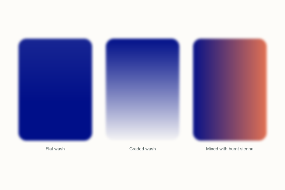
What color is phthalo blue?
| Hex | #000F89 |
| RGB | 0, 15, 137 |
| CMYK | 100, 89, 0, 46 |
| Warm or cool | Cool. Even the red shade is cooler than ultramarine, which is why phthalo makes such clean greens and such gray purples. |
| On the wheel | A blue on the green side of the wheel, between cobalt blue and the turquoises. The green shade sits well toward green; the red shade is closer to a straight blue. |
The story of phthalo blue
Phthalo blue started as a stain on the inside of a chemical vat, and it is now the most-produced pigment in the world.
That vat was at Scottish Dyes in Grangemouth, Scotland, in 1928. The works made phthalimide by passing ammonia through molten phthalic anhydride in a glass-lined iron reactor, and some batches came out with a blue impurity in them. The company's chemists isolated an extremely stable crystalline compound with iron in it, and the iron had come from the reactor itself. Chemists in Switzerland had stumbled on the copper version the year before, written it up as a curiosity and moved on. Scottish Dyes, and Imperial Chemical Industries, which took the firm over that same year, saw a product.

Working out what the stuff was took until 1934, when Patrick Linstead at Imperial College in London published its structure: a big flat ring of four linked units with a metal atom held in the middle, a close cousin of the porphyrin ring at the heart of chlorophyll. Linstead named the family phthalocyanine, from phthalic, for the chemical it grew out of, and cyanine, from the Greek for dark blue. ICI launched the copper version as Monastral Blue in 1935, IG Farben followed in Germany the same year, and DuPont in America in 1937.
Painters had been using Prussian blue as their deep, cheap, strong blue since about 1706, and it had habits. It faded in strong light, though it crept back in the dark, and it could not be trusted in a mixture with a lot of white. Phthalo did everything Prussian blue did and none of the rest: it does not fade, and about the only thing that dissolves it is concentrated sulfuric acid. The beta crystal is still the standard cyan of four-color printing. No wonder it took over.

The tube you buy today is PB15, and the number after the colon matters more than the name on the front. PB15:3, the green shade, makes clean turquoises and grass greens. PB15:1, the red shade, is closer to a straight blue and better for purples. Many makers sell it under a house name rather than as phthalo, so read the pigment code on the back. If you grew up watching Bob Ross, you have seen a lot of it.
My take is that phthalo blue is the color that taught me restraint. The first time I used it I put a normal brushload into a sky and got a swimming pool. You ration phthalo blue rather than paint with it, a fingernail at a time, and once you learn that it becomes the most useful blue you own. A stain in a Scottish vat, rationed properly, will paint you any sea on Earth.
Pigment facts
| Colour Index | PB15, copper phthalocyanine, a single synthetic pigment. The number after the colon is the crystal form: PB15:3 is the beta form, the green shade; PB15:1 is the stabilized alpha form, the red shade. The same molecule with chlorine added is phthalo green, PG7. |
| Transparency | Transparent. It glazes cleanly and never goes chalky, however far you dilute it. |
| Lightfastness | Excellent. Unaffected by heat and most chemicals, and one of the most lightfast pigments ever made. |
| Granulation | None. It dries perfectly smooth, which is either its virtue or its problem depending on the sky you wanted. |
| Staining | Very high. It sinks into the paper within seconds and will not lift; a damp brush lightens it a little and no more. |
| Toxicity | Non-toxic. The molecule is so inert that test animals fed more than five grams per kilo showed no ill effects, and there is no evidence it causes cancer. Do not breathe the dry powder. |
These describe the pigment in general. Every brand's tube behaves a little differently, so test yours on scrap paper.
How to mix phthalo blue
You cannot mix phthalo blue from anything else; nothing else is that strong or that clean. Green shade makes the best greens and turquoises and the grayest purples; red shade makes better purples and a straighter sky. If you only buy one, buy the green shade and get purples from a violet-leaning blue.
One pairing matters more than the rest: phthalo blue with burnt sienna. Between them they cover everything from a warm gray to a near-black, and because both are transparent the darks stay alive. Start with the sienna and add the blue a fingernail at a time, never the other way round.
| Mix | Recipe | Best for |
|---|---|---|
| Living black | Phthalo blue and burnt sienna, about one to two, mixed thick | The darkest darks, tree trunks against a sunset, lettering |
| Deep sea | Phthalo blue with a touch of Forest Green, plenty of water | Ocean water, deep pools, glass bottles |
| Bright leaf green | Lemon Yellow with a speck of phthalo blue, far more yellow than blue | Spring leaves, lawns in sun, limes |
| Storm gray | Phthalo blue with Venetian Red, leaning blue | Thunderheads, wet slate, the sea under cloud |
| Tamed phthalo | Phthalo blue with a speck of Sunset Orange | A blue that looks like a real sky instead of a swimming pool |
Closest mix from the Tobio's kit
Glacier Blue and Twilight Indigo, roughly one to one, then a speck of Ivory Black for the dark, almost navy masstone phthalo has straight from the tube. Glacier Blue brings the green lean, the indigo brings depth, and the black stops it looking like a sports drink. Use plenty of water, because the real thing is transparent. Test on scrap first and stop before it goes gray.
The 12-color kit does not include a tube of phthalo blue, so this is how I get there with what is in the palette. Running low on a color? The 12 paint refills drop straight into the wells.
Using phthalo blue in watercolor
Use phthalo blue for anything that has to be deep and clear at the same time: the sea past the breakers, or the top of a graded sky. Light comes back through even a strong wash, so the darks glow.
Glazing is the technique that suits it best. Because it stains and does not lift, you can lay a pale phthalo wash, let it dry, and paint over it a dozen times without disturbing it. A thin glaze of phthalo over a finished painting also cools the whole thing down in one move, the fastest fix I know for a picture that has gone too orange.
It pairs with the earths. Burnt sienna and Venetian Red both turn it into grays and darks with life in them, and a little Lemon Yellow turns it into every green on the hillside.
Something I learned the hard way: never take a wet brush straight from the pan to the paper. My first sky with it went from pale morning to midnight in one stroke, and there was no lifting it back out.
Everything I use on this page is the Tobio's Watercolor Kit: twelve colors chosen to mix, a walnut palette, cotton paper, and a water brush. Want to see how any two of the colors blend before you commit? Try the interactive color mixing chart.
Get the kitPhthalo blue vs ultramarine (and Prussian blue)
Ultramarine is the other blue everyone owns, and the two are opposites. Ultramarine leans violet, granulates, lifts easily and stays polite in a mix. Phthalo leans green, dries smooth, stains for good and overpowers everything. Ultramarine with a yellow gives you a soft, natural green; phthalo with the same yellow gives you a green that could stop traffic.
Prussian blue is the color phthalo gets compared with most, because it was the deep, strong, cheap blue of the trade for two centuries before. On paper, Prussian blue dries a little greener and duller, closer to ink, and it fades in strong light. Phthalo does not fade, and dries a cleaner, colder blue.
Which to buy first? Ultramarine, because it forgives you. Phthalo second, once you have learned to ration. If ultramarine is the sky at dusk and Prussian blue is a fountain pen, phthalo blue is the deep end of the pool.
Questions people ask
What color is phthalo blue?
Is phthalo blue warm or cool?
What colors make phthalo blue?
Is phthalo blue toxic?
Phthalo blue vs Prussian blue, what is the difference?
Phthalo blue green shade vs red shade: which should I buy?
Sources
- Copper phthalocyanine, Wikipedia
- Phthalocyanine, Wikipedia (discovery history, 1907 to 1934)
- Kupferphthalocyanin, Wikipedia (German; crystal forms and the PB15 suffixes)
- Phthalocyanines, in Colour Chemistry, Royal Society of Chemistry
- Textiles: tapestry dyeing (Teinture des Gobelins), engraving by R. Benard after Radel, Wellcome Collection
- Sudden Shower over Shin-Ohashi Bridge and Atake, Utagawa Hiroshige, The Metropolitan Museum of Art
More color stories
