


Payne's Gray
Payne's gray is a cool, dusty blue-gray that painters reach for instead of black. It is a mixture, not a single pigment, named after an English drawing master.
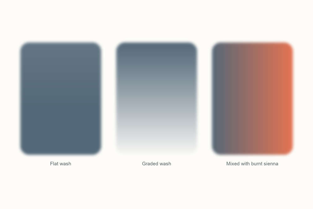
What color is Payne's gray?
| Hex | #536878 |
| RGB | 83, 104, 120 |
| CMYK | 31, 13, 0, 53 |
| Warm or cool | Cool. It leans blue, which is why shadows painted with it stay lively instead of going flat. |
| On the wheel | A blue pulled almost all the way to gray. It sits between indigo and a true neutral, on the cool side of the wheel. |
The story of Payne's gray
Payne's gray is one of the few colors on a paint rack named after a person, and the person was a teacher.
William Payne lived from 1760 to 1830. He started out as an engineer in Plymouth, moved to London around 1790, and became one of the most fashionable drawing masters in the city. That means he spent his days explaining watercolor to beginners. I have a soft spot for him for that reason alone.

His students kept hitting the wall every beginner hits: how do you paint a shadow without it going dead? Black is the obvious answer and the wrong one. A black shadow sits on the paper like a hole. Payne's fix was to mix a shadow color from what was already on the palette. The recipe varies depending on who is telling the story, but it was roughly Prussian blue (some say indigo) for the cool, a little yellow ochre to soften it, and a touch of crimson lake to stop it turning green. The result was a soft, slightly blue gray that darkened a wash without killing it.
The mix was useful enough that paint makers started selling it ready-made with his name on the label, and that is the version you buy today. The trade calls it a convenience color, which just means someone did the mixing for you. Every brand mixes it a little differently. Buy Payne's gray from three companies and you will get three slightly different grays, which confuses people who switch brands. The idea is the same in all of them: a blue pulled almost to gray, cooler than a plain black.
He was not universally admired for it. The serious painters of the day criticized Payne for reducing watercolor to a step-by-step method that anyone could follow, and he taught tricks like splitting a wet brush to paint foliage and dragging the side of a dry brush for rocks. Sounds familiar. The name Payne's gray was first recorded in print in 1835, five years after he died, and it has been in almost every paint range since.
Here is the part I like. Payne was not trying to invent a pigment. He was trying to stop his students from ruining their skies with black, and he got told off for making painting too easy. Two hundred years on, that is still exactly what the tube is for.
Pigment facts
| Colour Index | None of its own, because it is a mixture. Most brands blend a blue (PB29 ultramarine or PB15 phthalo) with a black (PBk6, PBk7 or PBk9). A few add a touch of violet. |
| Transparency | Semi-transparent. It glazes well and lets the paper glow through in thin washes. |
| Lightfastness | Excellent. Every ingredient in a modern Payne's gray is a lightfast pigment. |
| Granulation | Depends on the blue inside it. Ultramarine-based versions granulate gently; phthalo-based ones stay smooth. |
| Staining | Low to moderate. It lifts reasonably well while damp and less so once dry. |
| Toxicity | Non-toxic. No heavy metals in modern formulas. |
These describe the pigment in general. Every brand's tube behaves a little differently, so test yours on scrap paper.
How to mix Payne's gray
You do not need to buy Payne's gray. You can make it, and making it will teach you more about shadows than any tube will. The classic recipe is two parts ultramarine to one part burnt sienna. Pull the mix toward the blue and you have Payne's gray. Pull it toward the brown and you have a warm stone gray instead. That one pairing covers most of the neutrals in a landscape.
Keep it wet and keep it loose. Grays go muddy when you fuss with them on the paper, not when you mix them on the palette.
| Mix | Recipe | Best for |
|---|---|---|
| Payne's gray from scratch | 2 parts ultramarine, 1 part burnt sienna, a pinhead of black if you want it darker | Shadows on white walls, distant hills, storm clouds |
| Warm version | The same mix, tipped toward the burnt sienna | Wet pavement, rocks, tree bark in shadow |
| Storm sky | Payne's gray with a touch of indigo and plenty of water | Skies, choppy water, rain |
| Almost black | Payne's gray and black, half and half | Silhouettes, lettering, the darkest dark in a painting |
Closest mix from the Tobio's kit
Twilight Indigo and Ivory Black, roughly two to one, then the smallest touch of Venetian Red to take the electric edge off the indigo. Add water until it is a gray you would happily wear. Test on scrap first. A little Venetian Red goes a very long way.
The 12-color kit does not include a tube of Payne's gray, so this is how I get there with what is in the palette. Running low on a color? The 12 paint refills drop straight into the wells.
Using Payne's gray in watercolor
Use it where you would have used black. That is the whole trick. The shadow under a doorway, the far side of a hill, the underside of a cloud. Payne's gray darkens the area and keeps it looking like part of the picture, because the blue in it talks to the sky and the greens around it.
It is also my favorite color for a monochrome study. Paint the whole scene in three strengths of Payne's gray before you touch anything else and you will learn more about light and dark in an afternoon than in a month of full-color attempts. I still do this when a painting is not working. It is nearly always a value problem, not a color problem.
Wet-on-wet, it makes a moody sky in about a minute. Wet the paper, drop it in along the top, tilt, walk away. On dry paper it holds a crisp edge for rooftops and boats.
One warning. On very white paper it can dry colder than you expected. If a shadow feels icy, warm the next wash with a touch of Venetian Red or Sunset Orange rather than adding more gray.
Everything I use on this page is the Tobio's Watercolor Kit: twelve colors chosen to mix, a walnut palette, cotton paper, and a water brush. Want to see how any two of the colors blend before you commit? Try the interactive color mixing chart.
Get the kitPayne's gray vs Ivory Black (and Davy's gray)
Ivory Black is a true neutral. It darkens everything by the same amount and it is honest about it. Payne's gray is a blue with ambitions. Put them side by side in a shadow and black sits on top of the painting while Payne's gray sinks into it. In a wash the difference is even clearer: black dries flat and slightly brown, Payne's gray stays cool and a little alive.
Neither is better. Black is the right call for a silhouette against a sunset, or anything you want to read as a solid shape. Payne's gray is the right call for almost every shadow that is meant to have air in it. I keep both in the palette and I reach for the gray five times as often.
Davy's gray is the third one people ask about. It is greener, softer and much lighter, originally made from ground slate. Think fog rather than storm. If Payne's gray is a rainy evening, Davy's gray is a misty morning.
Questions people ask
Is Payne's gray warm or cool?
What colors make Payne's gray?
Why is Payne's gray so popular?
What can I use instead of Payne's gray?
Is Payne's gray a real pigment?
Is Payne's gray transparent?
Sources
More color stories
