


Prussian Blue
Prussian blue is a very dark, green-leaning blue made from iron and cyanide, and the first pigment ever created in a laboratory. It is transparent, stains hard, and is the blue of Hokusai's Great Wave.
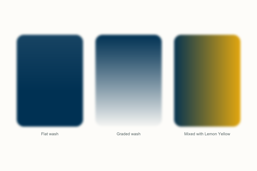
What color is Prussian blue?
| Hex | #003153 |
| RGB | 0, 49, 83 |
| CMYK | 100, 41, 0, 67 |
| Warm or cool | Cool. The green lean is why it makes such convincing natural greens with a yellow, and why it can look chilly alone. |
| On the wheel | A very dark blue leaning toward green: past indigo on the way to black, roughly opposite orange-red. |
The story of Prussian blue
Prussian blue was the first color anyone made in a laboratory, and the man who made it was trying to make red.
Johann Jacob Diesbach was a color maker in Berlin. Somewhere between 1704 and 1706 a batch of his cochineal red lake, made from cochineal, iron sulfate and potash, came out pale pink, and when he tried to concentrate it, it went purple, then deep blue. The potash had come from Johann Konrad Dippel, an alchemist who once tried to trade his elixir of life for Castle Frankenstein, and it was contaminated: with blood by one account, with Dippel's animal oil by another. The iron and the contamination made iron ferrocyanide, which is blue. The color was in letters to Leibniz by March 1708, was being called Preussisch blau by August 1709, and stayed a trade secret until John Woodward published the recipe in 1724.
Berlin blue, its other name, spread fast, because it was cheap and the alternative was ground lapis lazuli. Pieter van der Werff used it in an Entombment of Christ in 1709, the oldest painting we know of with it in, and the Prussian army put it on its infantry coats. It also named a poison: in 1782 Carl Wilhelm Scheele isolated hydrogen cyanide from it, so the acid is called prussic acid, and the word cyanide itself comes from the Greek for dark blue. The paint is harmless; the cyanide is locked to the iron and stays there.
The most famous use of it is Japanese. Printmakers there had been working with indigo, a plant dye that faded quickly, when Prussian blue began arriving from Holland in 1820 and then in bulk in 1829. They called it bero-ai, Berlin indigo. Hokusai, about seventy and broke, used it through his Thirty-six Views of Mount Fuji: the first ten prints are among the first Japanese prints to carry the new blue, and The Great Wave off Kanagawa followed late in 1831. Hokusai's best-known work is, among other things, an advertisement for a Berlin chemical.

Photography borrowed it next. In 1842 John Herschel found that paper brushed with an iron salt and potassium ferricyanide turns blue where sunlight hits it, and the blue that forms is Prussian blue itself; he called it cyanotype. Anna Atkins, a botanist friend of the Herschels, laid seaweed onto the treated paper and in October 1843 self-published Photographs of British Algae, the first book illustrated with photographs. From 1872 the same chemistry copied architects' drawings, which is why a plan is still called a blueprint, and it stayed standard until the 1940s.

Doctors use it too. Swallowed, Prussian blue binds thallium and radioactive cesium, which put it on the World Health Organization's list of essential medicines. What you buy today is the same iron blue Diesbach stumbled on, PB27, and the world makes about 12,000 tons of it a year, mostly for ink. I reach for phthalo blue more often, which arrived in 1935 and does the same deep-blue job without fading in tints or browning on chalky grounds. I keep a tube of Prussian blue anyway. Nothing else gives that inky, slightly green dark that looks like the sea at night.
Pigment facts
| Colour Index | PB27 (Colour Index 77510). Iron(III) hexacyanoferrate(II), Fe4[Fe(CN)6]3, an iron and cyanide complex. Also sold as Berlin blue, Paris blue, Milori blue and iron blue. |
| Transparency | Transparent. Thin washes glow; heavy ones read as nearly black. |
| Lightfastness | Good, with a quirk. Pure Prussian blue is permanent, but thin tints and mixes with a lot of white can fade in light and recover in the dark. It browns in alkaline conditions, so it dislikes lime and chalk grounds. |
| Granulation | None. The particles are so fine that the pigment behaves almost like a dye, and washes dry smooth. |
| Staining | High. It soaks into the paper fibers and will not lift once dry. Plan for it. |
| Toxicity | Non-toxic. The cyanide is bound so tightly to the iron that it stays put; the same compound is swallowed as a medicine. |
These describe the pigment in general. Every brand's tube behaves a little differently, so test yours on scrap paper.
How to mix Prussian blue
You can get close to Prussian blue with phthalo blue and a touch of black, but not all the way: the real thing is duller and inkier, and heads toward black when you pile it on. What it does better than any other blue is greens. With a warm yellow it gives deep, natural leaf greens; the old recipe was Prussian blue and gamboge.
Its other job is darks. With burnt sienna it makes a near-black that still reads as color, and it was the blue in William Payne's original shadow mix long before Payne's gray came in a tube. Go easy. A brush tip colors a whole puddle, and once it is on the paper it is staying there.
| Mix | Recipe | Best for |
|---|---|---|
| Old recipe green | Prussian blue and gamboge or any warm yellow, about one to three | Deep foliage, hedges, moss |
| Sea green | Prussian blue with a little Lemon Yellow and plenty of water | Shallow water, bottle glass |
| Storm dark | Prussian blue and burnt sienna, roughly equal | Wet rocks, silhouettes, the darkest dark |
| Night sky | Prussian blue with a touch of crimson | Skies after dark, denim, deep shadows |
Closest mix from the Tobio's kit
Glacier Blue and Ivory Black, about three to one, give you the deep, green-leaning blue that Prussian blue is. If it looks flat, a touch of Forest Green brings back the green undertone; if it looks too green, swap that for a speck of Twilight Indigo. The real thing is nearly black in the pan and only shows its color with water, so dilute before judging, and go carefully with the black. Test on scrap first.
The 12-color kit does not include a tube of Prussian blue, so this is how I get there with what is in the palette. Running low on a color? The 12 paint refills drop straight into the wells.
Using Prussian blue in watercolor
Use it where you want depth rather than brightness: the sea at night, a pine wood, worn denim. It is transparent, so even at full strength it has light behind it, which is what separates it from black.
Glazing suits it. A thin wash over a dry ochre wall or burnt sienna roof pushes it into shadow without turning it gray. Dropped into a still-wet yellow it makes instant leaf green, with edges you cannot get on a palette.
It pairs with the earths: burnt sienna for darks, yellow ochre for greens that look like real plants, Venetian Red for a brown-black with warmth in it. It does not need white; water does that.
One warning I learned the hard way. It stains. A stroke in the wrong place is there for good, so put it down late in a painting, and rinse the brush twice before you go back to a yellow. My first ruined set of leaves came from one dirty brush.
Everything I use on this page is the Tobio's Watercolor Kit: twelve colors chosen to mix, a walnut palette, cotton paper, and a water brush. Want to see how any two of the colors blend before you commit? Try the interactive color mixing chart.
Get the kitPrussian blue vs phthalo blue (and indigo)
Phthalo blue is the color that took most of Prussian blue's jobs. It is a copper compound, launched in 1935 as Monastral Blue, and in my experience brighter and steadier: no fading in thin tints, no fuss about chalky paper. Side by side, phthalo is clear glass and Prussian blue is ink. Both stain like mad.
Indigo is the older comparison. It is a plant dye, the blue of new jeans and the blue Japanese printers used before Prussian blue arrived, and on paper it faded, which is exactly why the import took over. Prussian blue is greener and darker; indigo is softer and more violet-gray.
If you want one deep blue for darks, phthalo is the sensible modern choice and Prussian blue is the romantic one. I use both. If phthalo blue is a swimming pool, Prussian blue is the harbor at night, and indigo is the jeans you wore to get there.
Questions people ask
What color is Prussian blue?
Is Prussian blue warm or cool?
What colors make Prussian blue?
Is Prussian blue toxic?
Prussian blue vs phthalo blue, what is the difference?
Why did Hokusai use Prussian blue?
Sources
More color stories
