


Pumpkin Watercolor Painting: Step-by-Step Tutorial

What You'll Need
- Watercolor Paper
- Pencil and eraser
- Two water cups
- Watercolors
- Round brush
Color Palette
Stop scrolling through hyper-realistic botanical illustrations. If you want to capture the essence of autumn without spending three hours blending perfectly smooth gradients, you need to embrace the "sketchbook style."
In this pumpkin watercolor painting tutorial, we are ditching the masking tape and the stress. We are going for a loose, expressive study that celebrates brushstrokes, water blooms, and happy accidents. This is the perfect project to fill a gap in your sketchbook during a coffee break.
If you want more projects like this after you finish, you can browse our full library of step-by-step lessons on Watercolor Tutorials.
The Expressive Color Palette
Based strictly on the warm, lively painting above, you only need three specific pigments to bring this autumn staple to life.
Put away the massive 48-color sets; limited palettes prevent muddy mistakes.
- Orange: The bright, vibrant punch for the main body and that glowing base.
- Burnt Sienna: A reddish-brown for adding depth to the ribs and natural texture.
- Burnt Umber: The deep, earthy dark used for the contrasting stem and bottom edges.

The "Barely There" Sketch
Don't get the ruler out.
Pumpkins are organic, lumpy, and imperfect, that's why we love them.
Draw a loose, slightly squashed oval to start. Mark a center point for the stem, then lightly sketch curved lines radiating from that center down to the bottom to create your segments.
Keep your pencil pressure light; if the lines show through the paint later, it just adds to the illustrative vibe.

The Glowing Base Wash
We start with a technique that prevents your pumpkin from looking flat and heavy.
Load your brush (a Round Size 6 is ideal) with watery Orange.
Paint the general shape of the pumpkin, but, and this is key, leave random gaps of unpainted white paper. Look at the reference image; those white flecks aren't white paint, they are the paper breathing.
This "negative space" makes the pumpkin look glossy and fresh rather than overworked.

Defining the Form
While your Orange layer is still slightly damp (shiny, but not soaking wet), it’s time to create the iconic ridges. Mix a juicy consistency of Burnt Sienna, think tea, not syrup, and use the tip of your brush to paint the curved lines over the orange wash.
Because the paper is damp, your lines will fuzzy out slightly, creating soft volume without manual blending. Once that settles, add a few distinct strokes to the "shadow side" of the ribs to create weight.

The Stem & Final Contrast
A pumpkin needs a handle to finish the look. Mix Burnt Umber with a tiny touch of Burnt Sienna so it isn't a dead black. Paint the stem with one confident stroke, pressing down at the base to make it wider.
For that true "artist" touch, touch the wet base of the stem to the top of the damp orange pumpkin body. Let the brown bleed slightly into the orange; this connects the two shapes so the stem doesn't look like a sticker pasted on top.
Style Variations: The "Midnight Patch," "Sunlit Gourd," and "Storybook Harvest"
Want to change the vibe of your pumpkin watercolor painting?
Try these quick sketchbook adaptations:
The "Midnight Patch" (Moody & Dramatic)
- Cool the palette: Swap your warm, sunny Orange for deeper, muted rusts. Mix a touch of Blue or extra Brown into your Burnt Sienna for a heavy, shadowy base.
- Deepen the shadows: Paint one side of the pumpkin much darker, leaving only a tiny sliver of pale rim light on the edge of the curve.
- Lost edges: Let the bottom of the pumpkin bleed entirely into a dark, heavy cast shadow to anchor the gourd in the deep autumn evening.
The "Sunlit Gourd" (Soft & Gentle)
- Lighten the palette: Stick to highly watered-down Orange and the palest wash of Burnt Sienna.
- Soften the features: Round out the defined, crisp edges of the ribs so they sit as soft, gentle indentations rather than deep grooves.
- The "Fresh" Texture: Skip the heavy, crunchy shadows under the stem. Keep the washes light, smooth, and fluffy for a fresh, early-harvest look.
The "Storybook Harvest"
- Exaggerate shapes: Push the shape language into stylized, geometric blocks. Give the pumpkin a more distinct, squat shape or perfectly swooping, graphic ribs.
- Bring back the speckles: Lean into the illustrative vibe by flicking a few perfect, deliberate splatters of orange and brown paint around the dry painting for a whimsical texture.
- Flat color: Skip the beautiful, messy watercolor bleeds. Use flat, highly-pigmented, graphic washes of solid color for a modern, pop-art feel.
Inspiration: Why This Style Works
This loose, expressive sketchbook approach to a pumpkin watercolor painting is perfect for:
- Seasonal Journals and Farm Sketchbooks:
Capture the cozy energy of a patch visit without needing a macro lens or a botany degree. You don’t need to paint every single bump or scar; you just need that bold, iconic orange shape and a deep shadow to bring the memory back to life on the page. - Cozy & Rustic Wall Decor:
Because pumpkins are naturally warm and inviting, a soft, loose study looks incredibly sophisticated in a kitchen or a cozy reading nook. Frame a lively, 15-minute piece like this for instant, nature-inspired wall art that feels vibrant and organic, rather than stiff and "store-bought."
Questions, answered
How do I keep my pumpkin watercolor painting from looking stiff?
Speed is the secret. Beginners often over-blend edges, which kills the sketch's energy. Lay down your Orange wash quickly, drop in your Burnt Sienna, and stop. Let the blooms happen, imperfections make it look like art, not a sticker.
Why does my pumpkin look flat instead of round?
Volume comes from contrast. If your pumpkin watercolor painting looks 2D, you likely lost your white highlights. Leave gaps of unpainted paper for light, and be brave with dark Burnt Umber in the deepest creases to push the orange forward.
Do I need masking fluid for the highlights?
No, skip it! Masking fluid creates sharp, artificial edges that clash with this loose style. Instead, practice "negative painting", simply painting around the shiny spots. It creates a softer, organic glow that fits the rustic vibe much better.
Conclusion
You don’t need complicated tricks to make lovely pumpkin watercolor paintings. A simple sketch, one consistent light source, wet-on-wet base layers, and a few careful glazes will get you that soft, dimensional pumpkin look. Try the orange, white, and teal trio once, then repaint it with different colors and you’ll be shocked how fast your confidence grows.
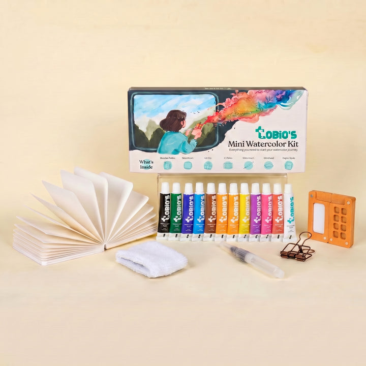
If you want to keep the momentum going without overthinking supplies, take a look at Tobio’s Kits and pick a kit that helps you practice watercolor fundamentals you can reuse on pumpkins, leaves, and everything else you’ll want to paint next.
Mel, Founder
More 15-minute tutorials
Ready to Paint?
This tutorial was designed for use with our Watercolor Paint Kit.
Shop the Kit


