Pantone Color of the Year 2027: Predictions, Vote and How to Mix Each Shade


The Pantone Color of the Year 2027 has not been announced yet. Pantone is expected to name it in early December 2026. Until then, vote for the color you think will win, learn how to mix it in watercolor, and look back at every winner since 2000.
Vote: what will the Pantone Color of the Year 2027 be?
Tap the color you think Pantone will pick, then add your email to lock it in. Everyone who picks the closest color gets a special Tobio's discount code by email on announcement day.
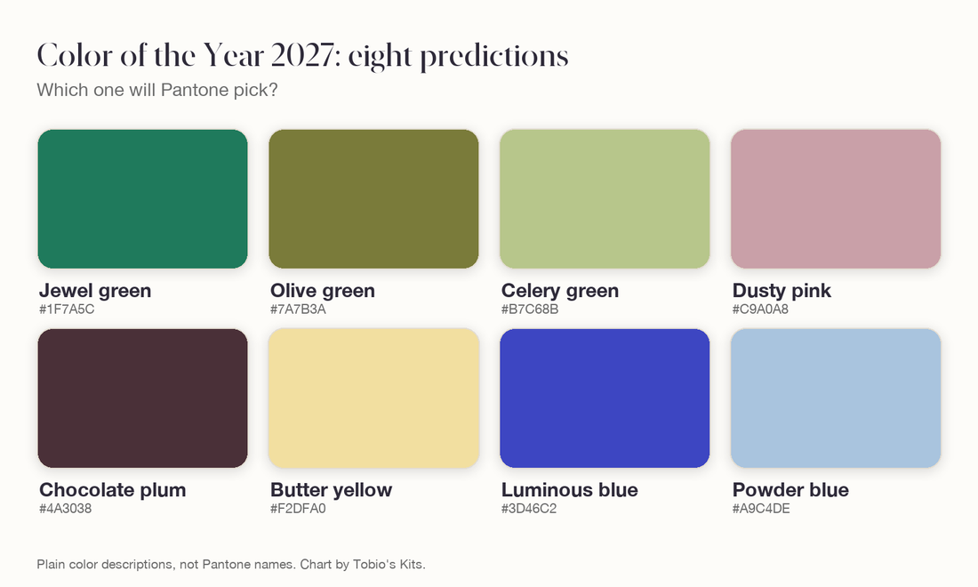
How it works: one entry per email, and you need an email entry to win. Entries close the moment Pantone announces. The winning pick is the candidate closest to Pantone's color, decided by Mel. The candidates are jewel green, olive green, celery green, dusty pink, chocolate plum, butter yellow, luminous blue and powder blue.
At a glance
- Announcement Early December 2026 (expected)
- Most predicted for 2027 A green
- Current color (2026) Cloud Dancer, PANTONE 11-4201
- Chosen by The Pantone Color Institute
- First winner Cerulean, in 2000
- Prize for a right guess A Tobio's discount code
The eight predictions for 2027 and how to mix each one
These eight color families come up most often in designer and forecaster predictions for 2027. The names are plain descriptions, not Pantone names. Every recipe uses the twelve colors in the Tobio's Watercolor Kit.
Jewel green
A deep, rich emerald, the favorite of designers who want strong color back. Recipe: Forest Green at cream thickness with a touch of Glacier Blue. Too dark: add water. Too blue: add Green Gold.
Olive green
A warm, earthy green with brown in it. Recipe: 3 parts Green Gold, 1 part Venetian Red, a pin-tip of Ivory Black. Too brown: add Green Gold.
Celery green
A pale, fresh yellow-green, like matcha with milk. Recipe: 2 parts Green Gold, 1 part Lemon Yellow, thinned to tea, with a pin-tip of Venetian Red. Too yellow: add Green Gold.
Dusty pink
A faded, grayish rose that works like a neutral. Recipe: Electric Rose thinned to tea, a touch of Royal Plum, a pin-tip of Forest Green. Too sweet: add the green.
Chocolate plum
A very dark brown with violet in it, the next step after Mocha Mousse. Recipe: 2 parts Venetian Red, 1 part Twilight Indigo, a touch of Royal Plum, at cream thickness. Too red: add Twilight Indigo.
Butter yellow
A pale, creamy yellow with a little sand in it. Recipe: Lemon Yellow thinned to tea with a pin-tip of Sunset Orange, plus a little Titanium White for the creamy look. Too orange: add water.
Luminous blue
A vivid blue that leans violet. Recipe: Twilight Indigo at cream thickness with a touch of Glacier Blue. Too violet: add Glacier Blue.
Powder blue
A pale, soft sky blue. Recipe: 2 parts Glacier Blue, 1 part Twilight Indigo, thinned to tea, with a pin-tip of Sunset Orange. Too green: add Twilight Indigo.
My own vote went to olive green. I have been wrong before.
How does Pantone choose the Color of the Year?
Pantone chooses the Color of the Year through trend research by color experts at the Pantone Color Institute, not through a vote or sales figures. The team spends the year looking at fashion, film, art, design, travel, technology, social media and big sporting events, and picks the one shade that fits the mood of the moment.
Nobody outside knows the answer early, so guessing is fair game. The form guide:
- Three quiet years in a row: Peach Fuzz (2024), Mocha Mousse (2025) and Cloud Dancer (2026) are all soft neutrals.
- Green is overdue: the last green winners were Greenery in 2017 and Emerald in 2013.
- Paint brands went green: Sherwin-Williams named Celery and Behr named Grounded as their own 2027 colors.
- Blue has backing: the trend forecaster WGSN picked Luminous Blue for 2027. The last blue Pantone winner was Classic Blue in 2020.
- Pink has waited longest: the last pink was Rose Quartz in 2016.
Name the hue family
Say which family the color belongs to (red, orange, yellow, green, blue, violet, brown or gray) and which way it leans. Viva Magenta is a red that leans pink. That sentence tells you which two paints to pick up.
Mix the two nearest paints
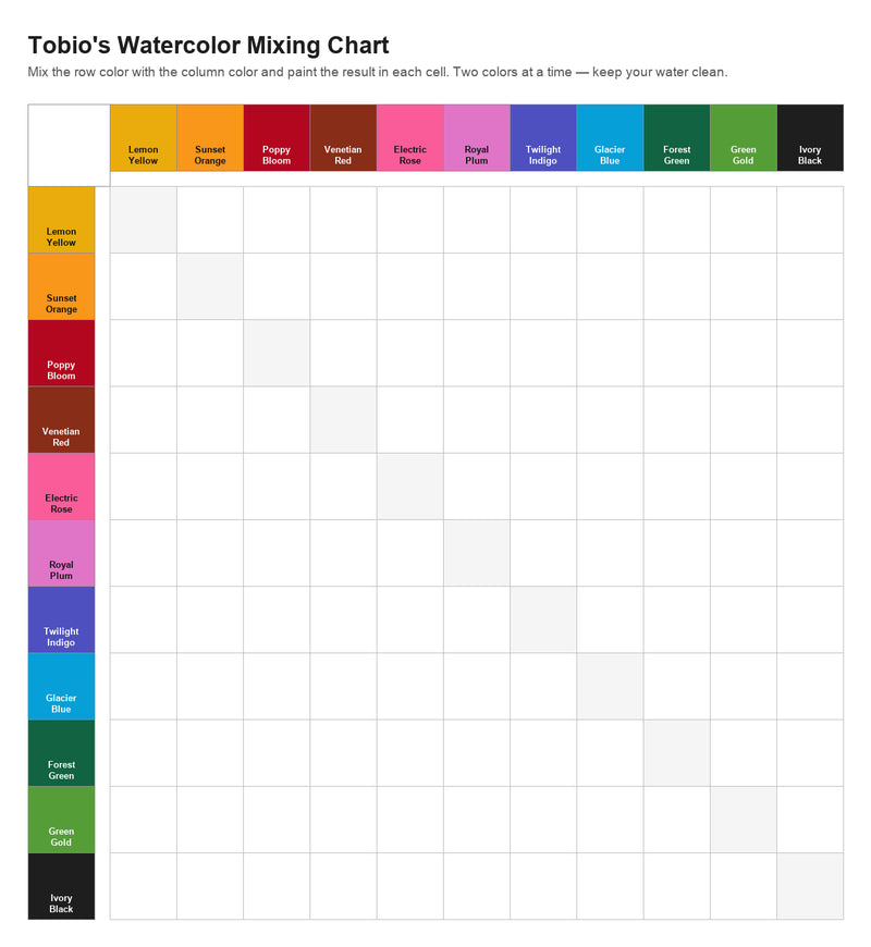
Put the main color in the mixing area, then add the second a little at a time. For a pink-leaning red, that is Poppy Bloom with Electric Rose added. The interactive mixing chart shows what every pair of kit colors makes.
Set the lightness with water
In watercolor you lighten a color by adding water, because the white paper shines through. Peach Fuzz is mostly water. Classic Blue is thick paint. Use Titanium White only when you want a milky, opaque look.
Mute it with the opposite color
To calm a color down, add a tiny touch of its opposite on the color wheel: green into red, orange into blue, violet into yellow. Black also dulls a color, but makes it flat. My guide to mixing watercolors explains why.

Swatch, dry, compare, adjust
Paint a small square on scrap paper and let it dry, because watercolor dries lighter. Hold it next to the reference and adjust once: more paint if it is pale, a touch of the opposite if it is too bright.
How to mix every Color of the Year since 2020
Each Pantone Color of the Year since 2020 can be mixed from two or three of the twelve kit colors. These are starting recipes: swatch, let it dry and adjust.
2026: Cloud Dancer (PANTONE 11-4201)
A soft, airy white. Screen value about #F0EEE9. Recipe: leave the paper bare for the lightest parts. For the color itself, a pin-tip of Ivory Black and a pin-tip of Sunset Orange in a large puddle of water. Too gray: add water. The titanium white color story has more on painting white.
2025: Mocha Mousse (PANTONE 17-1230)
A soft, warm brown. Screen value about #A47864. Recipe: 2 parts Venetian Red, 1 part Sunset Orange, a touch of Twilight Indigo, at milk thickness. Too red: add Twilight Indigo.
2024: Peach Fuzz (PANTONE 13-1023)
A pale peach between pink and orange. Screen value about #FFBE98. Recipe: 3 parts Sunset Orange, 1 part Electric Rose, thinned to tea. Too orange: add Electric Rose. See the coral color story for its stronger cousin.
2023: Viva Magenta (PANTONE 18-1750)
A deep crimson red that leans pink. Screen value about #BB2649. Recipe: 2 parts Poppy Bloom, 1 part Electric Rose, at cream thickness. Too pink: add Poppy Bloom.
2022: Very Peri (PANTONE 17-3938)
A periwinkle: medium blue with a violet lean. Screen value about #6667AB. Recipe: 3 parts Twilight Indigo, 1 part Royal Plum, at milk thickness. Too violet: add Glacier Blue.
2021: Illuminating (PANTONE 13-0647)
A bright, cheerful yellow. Screen value about #F5DF4D. Recipe: Lemon Yellow between tea and milk, with a pin-tip of Green Gold. Too green: add Lemon Yellow.
2021: Ultimate Gray (PANTONE 17-5104)
A neutral mid gray, the second 2021 color. Screen value about #939597. Recipe: Ivory Black at milk thickness with a pin-tip of Glacier Blue. Too blue: add a touch of Venetian Red.
2020: Classic Blue (PANTONE 19-4052)
A deep, steady blue. Screen value about #0F4C81. Recipe: 2 parts Twilight Indigo, 1 part Glacier Blue, at cream thickness, with a pin-tip of Ivory Black. Too violet: add Glacier Blue.
Every Pantone Color of the Year, 2000 to 2026
Pantone has named a Color of the Year every year since 2000, with two colors in 2016 and in 2021. Each winner is shown below, newest first, with its year, PANTONE code, closest hex value and a plain description.
Why your mix will not match the screen exactly
A watercolor mix cannot match a screen color exactly, because a screen makes color with light and paint makes color with pigment on paper. The hex codes on this page are close screen values, not official paint formulas. Aim for the same family, the same lightness and the same mood.
PANTONE and Color of the Year are trademarks of Pantone LLC. Tobio's Kits is not affiliated with Pantone. The charts, recipes and hex values here are our own approximations for painters.
Questions people ask about the Pantone Color of the Year
What is the Pantone Color of the Year 2027?
Pantone has not announced its Color of the Year 2027 yet. The announcement is expected in early December 2026. Predictions lean toward a green, with dusty pink, a dark plum brown and blue also named often.
What is the Pantone Color of the Year?
The Pantone Color of the Year is one shade chosen each year by the Pantone Color Institute as a color trend forecast. It has been named every year since 2000, when the first choice was Cerulean.
When is the Pantone Color of the Year announced?
Pantone announces the Color of the Year in early December for the year ahead. Cloud Dancer, the 2026 color, was announced in December 2025.
What is the Pantone Color of the Year 2026?
The Pantone Color of the Year 2026 is Cloud Dancer, PANTONE 11-4201, a soft white.
Can you buy the Pantone Color of the Year as watercolor paint?
Pantone is a color standard used in print, fashion and design, not a range of artist watercolors. Painters match the shade by mixing two or three colors from a basic set.
How do I match a hex code in watercolor?
Name the hue family, mix the two nearest paints, set the lightness with water and mute it with a touch of the opposite color. Then swatch, let it dry and compare.
Guess it, then mix it
Whatever Pantone picks, the skill is the same: match a color you can see with the paints you have.
Pick one shade from this page, mix it, let the swatch dry and hold it next to the screen. Then adjust once. And if you have not voted yet, scroll back up. I want to know who else thinks it will be green.
Mel, FounderLike these guides? Set Tobio's as a preferred source on Google and our pages will show up first when you search for watercolor questions.
Keep mixing
Twelve colors that mix into all of these
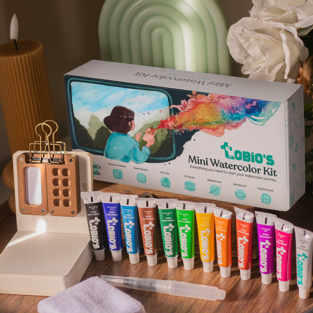
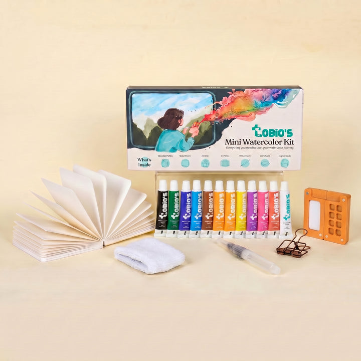
Every recipe on this page uses the twelve colors in the Tobio's Watercolor Kit, with a water brush, cotton paper and a guided workbook in one pocket-sized palette.
Get the Tobio's Watercolor Kit