秋の水彩画:ステップバイステップチュートリアル

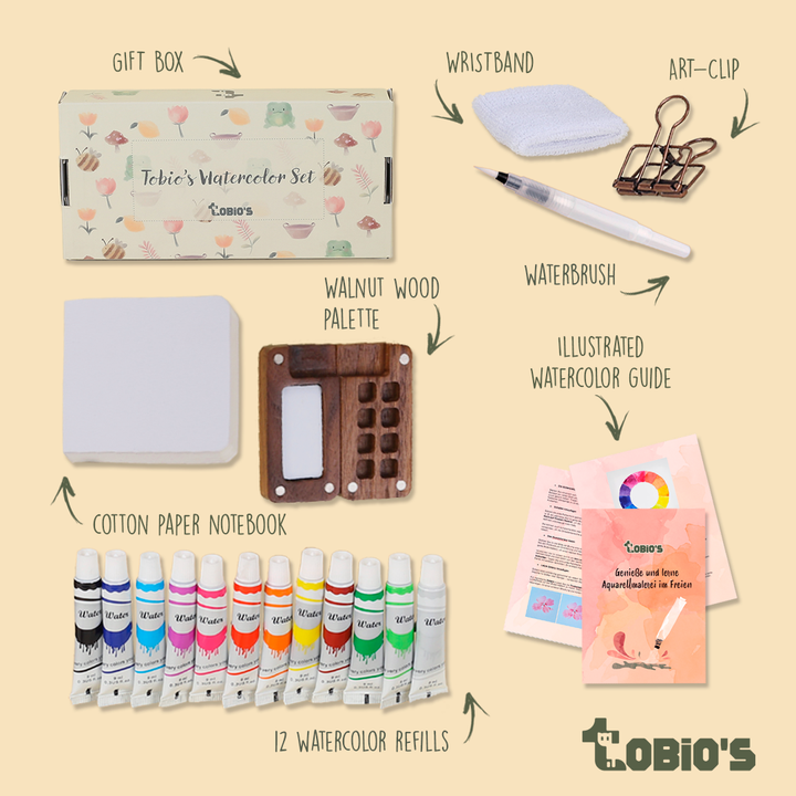
What You'll Need
- 紙
- 鉛筆と消しゴム
- 水カップ2つ
- 水彩絵の具
- 丸筆
Color Palette

「乱れた」空のウォッシュ

ソフトホライゾン

前景と道

木(ウェットオンドライ)
「キラキラ」ディテール
インスピレーション:このスタイルがなぜ機能するのか
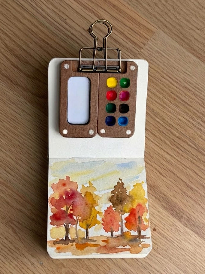
自然日記と公園のスケッチブック:
集中したスタジオのセットアップや何時間もの時間を必要とせずに、公園のベンチに座りながら変わりゆく季節のはかない色を捉えましょう。樫の木のすべての葉を描く必要はありません。あの暖かく象徴的なオーカーとシエナのコントラストと、ページに澄んだ秋の空気を持ち込むためのゆるい手だけが必要です。
季節のこもったウォールデコレーション:
秋の風景は自然と暖かく魅力的なため、柔らかくゆるいスタディは廊下や暖炉の上に置くと信じられないほど洗練されて見えます。このような活気ある15分の作品を飾れば、「店で買った」ようなぎこちなさではなく、有機的でさらさらと揺れるような動きに満ちた、即席の季節的なウォールアートになります。
Questions, answered
My sky bled into the trees, did I ruin the painting?
No. We want that. In a loose fall watercolor painting, connected shapes create atmosphere. If every edge is perfect, it looks like a sticker book. Embrace the bleed; it looks like mist.
How do I stop my colors from turning into brown mud?
Stop mixing on your palette. Since we are using earth tones (Yellow Ochre and Burnt Sienna), they get dull if over-blended. Drop them wet-into-wet directly on the paper and let them mix there to keep the glow.
Why does my painting look flat halfway through?
You are missing the darks. A watercolor often looks messy until the final step. The "glow" only pops once you add the deep Burnt Umber tree trunks (Step 4) to create contrast against the light sky. Trust the process.
Conclusion
15分
Mel, Founder
More 15-minute tutorials