


Autumn Watercolor Painting: Step-by-Step Tutorial


What You'll Need
- Watercolor paper: 140 lb (300 gsm)
- Paints
- Round brush (size 4 to 8)
- Two water jars
- Paper towel or cloth
- Fineliner or gel pen for details
Color Palette
You want an autumn watercolor painting that feels cozy and spontaneous, but let's be real: sometimes 'watercolor' feels like a synonym for 'stress.' One second you're aiming for a masterpiece, and the next you're watching a muddy puddle form in the center of your page.
Let's ditch the pressure. This isn't about creating a gallery-ready canvas; it's about a 25-minute, expressive sketchbook study. Why 25 minutes? It's the perfect amount of time to let the water do the work without giving you enough time to overthink it. We are going for 'loose and juicy,' not 'perfect and tight.' Forget the masking tape and the complex sketches.
The 'Cozy Warm' Color Palette
Based on the swatch card, we are sticking to a limited, bulletproof palette. By limiting yourself to these specific pigments, you guarantee harmony before your brush even hits the paper.
- Warm Yellow (Raw Sienna or Naples Yellow): This is your light base. It's creamy and soft, not neon.
- Warm Orange (Cadmium Orange): The heavy lifter for that pumpkin-spice vibe.
- Warm Red (Venetian Red): A brick-red earthy tone. Avoid cool reds like Alizarin here; we want warmth.
- Brown (Burnt Sienna): The absolute king of autumn textures.
- Dark Neutral (Payne's Gray): We use this instead of black to keep shadows rich and moody, not dead.

The 'Wet-ish' Blob
Dip your brush in clean water and wet the general shape of a tree canopy on your paper. It doesn't need to be a perfect circle, make it wonky. While the paper is wet, load your brush with your Raw Sienna (Warm Yellow) and drop it into the top left of the wet area. Watch it explode. That's the magic. Don't overwork it.

The Color Drop
While the yellow is still shiny (wet), pick up your Cadmium Orange. Touch the tip of the brush to the paper in random spots within that wet shape. Let the orange bleed into the yellow naturally.
- Artist Tip: Resist the urge to scrub. Put the paint down and lift your hand away. Let the water mix the paint for you.

Deepening the Mood
Now, grab your Venetian Red or Burnt Sienna. Drop this color into the bottom right of the foliage (the shadowed side). This creates instant 3D form without you having to 'draw' a shadow. If things get too wet, dab a corner with a paper towel, but leave the rough edges! We want this to look like a sketch.

The One-Stroke Trunk
Wait about 5 minutes for the shine to fade slightly from the leaves. Load your brush with a thick mix of Burnt Sienna mixed with a tiny touch of Payne's Gray. Starting from inside the bottom of the foliage, pull one confident stroke down for the trunk. Don't paint a rectangle; paint a gesture. Press down for the base, lift up for the branches.
Ground and Contrast
Use that leftover dirty water on your brush to swipe a quick horizontal line under the tree for a shadow. Finally, take pure Payne's Gray and add tiny, dark accents on the right side of the trunk or a few stylized branches peaking out of the leaves.
- Done. Put the brush down. Walk away.
Style Variations
The 'Late November' (Moody & Dramatic)
- Cool the palette: Swap your warm, sunny yellows for deeper, muted browns.
- Deepen the shadows: Paint the trunk and the ground much darker.
- Lost edges: Let the bottom of the tree canopy bleed entirely into a dark, heavy ground wash.
The 'Golden Hour' (Soft & Gentle)
- Lighten the palette: Stick to highly watered-down Warm Yellow and the palest wash of Warm Orange.
- Soften the features: Round out the jagged, textured edges.
- Skip the heavy, dark accents on the branches.
The 'Storybook Forest' (Simplified for Cards & Patterns)
- Exaggerate shapes: Push the shape language into stylized, geometric blocks.
- Bring back the speckles: Lean into the illustrative vibe.
- Flat color: Use flat, highly-pigmented washes for a modern, folk-art feel.
Inspiration: Why This Style Works
This loose, expressive sketchbook approach to an autumn watercolor painting is perfect for:
- Nature Journals and Hiking Sketchbooks: Capture the fierce color of a changing maple you spotted on a walk without needing a botanical degree.
- Bold & Eclectic Wall Decor: Frame a lively, 25-minute piece for instant, nature-inspired wall art that feels vibrant and full of movement.
Questions, answered
My autumn watercolor painting turned to mud. Why?
You likely mixed cool colors (like blue or green) while the paper was wet. Stick strictly to the warm palette (Yellow, Orange, Red) and let the orange layer dry completely before adding dark contrasts.
Do I really need special paper for a quick sketch?
Yes. Standard paper will buckle and ruin the wet-on-wet effect. You need at least 140lb (300gsm) sketchbook paper to handle the water and keep colors vibrant.
How do I stop overworking the painting?
Set a timer. When 25 minutes is up, brushes down. Trying to fix every bloom kills the energy; the 'mistakes' are what make the sketch look loose and handmade.
Conclusion
The secret to a great autumn watercolor painting isn't hours of layering, it's knowing when to stop. By using this limited warm palette and trusting the wet-on-wet process, you get a sketchbook page that feels alive and vibrant.
Mel, FounderLike these guides? Set Tobio's as a preferred source on Google and our pages will show up first when you search for watercolor questions.
More 15-minute tutorials
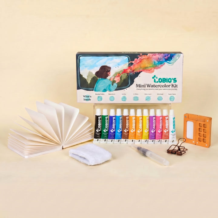
Ready to Paint?
This tutorial was designed for use with our Autumn Palette Kit.
Shop Watercolor Kit


