


Spring Watercolor Painting: Step-by-Step Tutorial

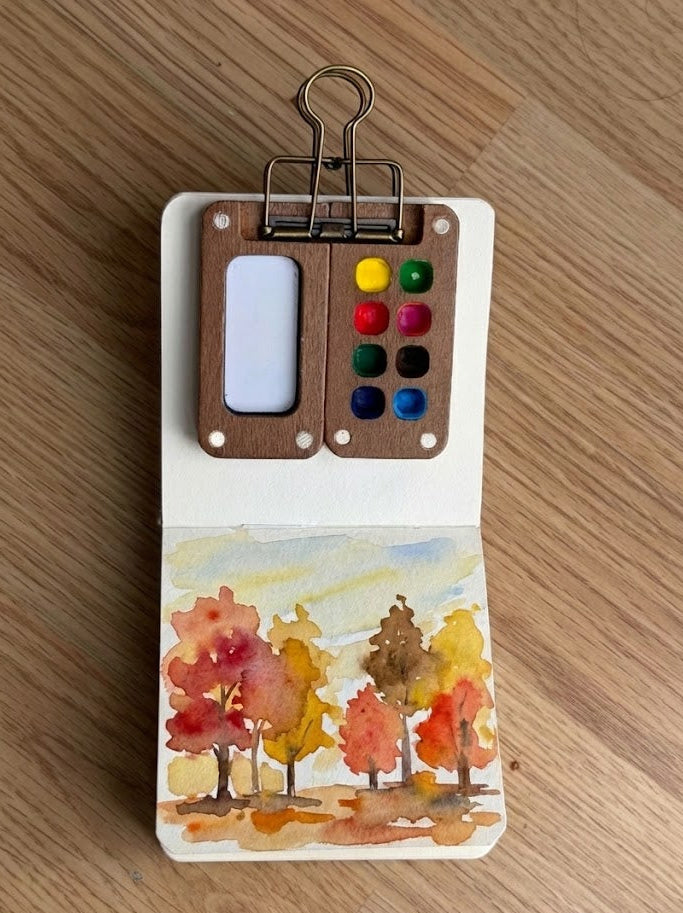
What You'll Need
- Watercolor Paper
- Pencil and eraser
- Two water cups
- Watercolors
- Round brush
Color Palette
If your goal is to capture the feeling of a breezy April afternoon without spending three days hunched over a desk, you’re in the right place. This isn't about botanical precision; it's about the "Loose Sketchbook Style." We’re going to lean into the chaos of the medium to create a fast, vibrant spring watercolor painting that celebrates suggestion over detail.
Grab your sketchbook, ideally something with 140lb (300gsm) cold press paper so it can handle the water without waving a white flag, and let’s get messy.
If you want more projects like this after you finish, you can browse our full library of step-by-step lessons on Watercolor Tutorials.
The Expressive Color Palette for Your Spring Watercolor Painting
Based strictly on the warm, lively landscape study above, you only need five specific pigments to bring this scene to life. Put away the massive 48-color sets; limited palettes prevent muddy mistakes and keep your sketchbook looking airy and intentional.
- Cerulean Blue: For that breezy, high-altitude sky wash.
- Sap Green: Your primary tool for the rolling hills and the leafy tree canopies.
- Lemon Yellow: The bright, sun-soaked punch for the foreground flower and for mixing "new leaf" highlights into your greens.
- Permanent Rose: A transparent, punchy pink for the expressive wildflower on the right.
- Burnt Sienna: A warm, earthy brown for the simple, structural tree trunks.

The "Single Swipe" Sky
Load a medium round brush with a very watery Cerulean Blue. Starting near the top, pull a horizontal, uneven wash across the page. Don't worry about filling the corners. Leave some "white space" at the bottom of the sky to suggest distant clouds or haze. This keeps the piece airy.

Rolling Hills in Sap Green
While the sky is still a bit damp (or dry, if you want sharper horizons), lay in your hills. Use Sap Green mixed with a little Lemon Yellow for the sun-drenched slopes. Paint 2–3 overlapping "mounds." Notice in the study how the green isn't solid, let the water create natural light and dark spots.

Sketchy Tree Structures
Once your hills are tacky but not soaking, it’s time for the trees.
- The Canopy: Dab Sap Green in loose, cloud-like shapes. Don't paint every leaf; paint the "idea" of a tree.
- The Trunks: Use a small brush and Burnt Sienna to "drop in" the trunks. Let the brown bleed slightly into the green leaves. It adds a natural, organic connection that looks professional but takes zero effort.

Foreground "Pops" of Color
This is the "Spring" in your spring watercolor painting. In the bottom right, use a thick mix of Lemon Yellow and Permanent Rose to dabs two distinct flower shapes. Keep them "blobby", the eye will fill in the rest. Add a few quick upward strokes of Sap Green around them to ground them in the grass.
Style Variations: The "Overcast Meadow," "Golden Hour Hillside," and "Storybook Meadow"
Want to change the vibe of your spring watercolor painting?
You don't need a new sketch, just a different approach to your washes.
Try these quick sketchbook adaptations:
The "Overcast Meadow" (Moody & Dramatic)
- Cool the palette: Swap your sunny greens for deeper, muted tones. Mix a touch of Cerulean Blue or even a drop of Payne’s Gray into your Sap Green for a heavy, moisture-laden grass color.
- Deepen the shadows: Paint the base of the hills much darker, leaving only a tiny sliver of pale light on the very top ridges to suggest a break in the clouds.
- Lost edges: Let the distant tree line bleed entirely into a damp, grey-blue sky wash to anchor the scene in that "just about to rain" spring atmosphere.
The "Golden Hour Hillside" (Soft & Gentle)
- Warm the palette: Lead with highly watered-down Lemon Yellow and the palest wash of Permanent Rose in the sky instead of blue.
- Soften the features: Instead of distinct tree trunks, use soft, rounded dabs of color that bloom into each other. Keep the edges of your hills blurry and "glowy."
- The "Fresh" Texture: Skip the heavy, dark shadows under the trees. Keep the washes light, smooth, and transparent for a warm, hazy afternoon look.
The "Storybook Meadow" (Simplified for Cards & Patterns)
- Exaggerate shapes: Push the shape language into stylized, geometric blocks. Give your hills a more distinct, undulating curve and treat the trees as perfect, leafy lollipops.
- Bring back the speckles: Lean into the illustrative vibe by flicking a few perfect, deliberate splatters of Permanent Rose and Lemon Yellow paint around the foreground for a whimsical, "confetti" flower texture.
- Flat color: Skip the messy watercolor bleeds. Use flat, highly-pigmented washes of solid Sap Green and Cerulean Blue for a modern, graphic feel that’s perfect for stationery.
Inspiration: Why This Spring Watercolor Painting Style Works
This loose, expressive sketchbook approach to a landscape is perfect for:
- Nature Journals and Travel Sketching:
Capture the fresh energy of a park visit or a weekend hike without needing a tripod or a degree in fine arts. You don’t need to paint every blade of grass; you just need that bold, iconic contrast of green hills against a blue sky to bring the memory back to life on the page. - Fresh & Airy Home Decor:
Because spring landscapes are naturally calming and bright, a soft, loose study looks incredibly sophisticated in a kitchen or a sun-drenched breakfast nook. Frame a lively, 15-minute piece like this for instant, nature-inspired wall art that feels breezy and full of movement, rather than stiff and over-rendered.
Questions, answered
How do I prevent my spring watercolor painting from looking muddy?
To keep colors fresh, use a limited palette and avoid overworking the paper. Start with a clean jar of water and let your first hill wash dry completely before layering your darker Sap Green trees or Burnt Sienna trunks on top.
Is 140lb paper necessary for a quick 15-minute sketchbook study?
Yes, using 140lb (300gsm) cold press paper is the secret to success. It allows the water to sit on the surface long enough for you to create those beautiful, soft bleeds in the sky and hills without the page warping or drying instantly.
How do I know when my spring watercolor painting is actually finished?
The "loose" style relies on restraint, so stop once you have your main shapes and a few pops of color. If you have a clear sky, rolling hills, and a vibrant Permanent Rose flower, you’ve captured the essence of spring, don't feel the need to add every leaf.
Conclusion
Great spring watercolor paintings aren’t about perfect detail. They’re about clean color, soft edges where you want them, and just enough contrast to make the subject pop. Pick one simple spring motif, use a fresh palette, work in light layers, and let the medium do its beautiful, unpredictable thing.
Mel, Founder
More 15-minute tutorials

Ready to Paint?
This tutorial was designed for use with our Watercolor Paint Set.
Shop the set


