


Watercolor Glazing: How to Layer Colors for Depth


What You'll Need
- Transparent watercolor paints (test over dried black ink if unsure)
- A soft round or flat brush for even washes
- Watercolor paper — and patience; each layer must dry fully
I’m Mel, founder of Tobio’s, and glazing is one of my favorite watercolor techniques. Not everyone does it, but once you start, you’ll probably love it too. I learned it from an online demo a couple of years ago, and what’s so cool is how it makes your colors pop — they become vibrant, almost lit from behind. You glaze a transparent layer over what you’ve already painted, and light builds and glows through the paint. It’s like adding a tinted window on top of your painting. The result is stunning.
Sounds difficult? It really isn’t. This piece covers what glazing is, why some of your paints will work for it while others fight you, and how to build depth without your colors blending into mud. For an overview of more techniques, start with our watercolor tutorials hub, then come back here.
What glazing is
Glazing means washing a thin, almost-transparent layer of watercolor over a layer that has already dried (important!). Light passes through the top layer like glass and hits the one underneath, so by the time it reaches your eyes it’s been colored twice. The painting ends up looking deeper and more luminous at once.
The key word is transparent. Use too much pigment and it’s just normal layering. A glaze is a wet-on-dry technique by definition, and the layers below have to be bone-dry before you touch them — for the mechanics of dry-paper work, see our wet-on-dry technique guide.
Why transparency matters
Pigments fall into two camps: transparent ones let light travel through to the layer below, and opaque ones block it. Glazing needs the transparent kind. Paint labeling is governed by standards — ASTM D5067 sets requirements for pigment identification, lightfastness, and labeling — but transparency isn’t covered there, so manufacturers publish their own ratings (Daniel Smith and Jane Blundell are widely used references). Transparency tracks with pigment family, not color name: quinacridones and phthalos are famously transparent, while earth pigments and cadmium-family colors lean opaque. Anything sold as a pastel or tint contains white, which makes it opaque by construction.
Which Tobio’s colors glaze well
The Tobio’s 12-color palette — laid out in our guide to setting up a palette — includes Venetian Red, Poppy Bloom, Sunset Orange, Lemon Yellow, Green Gold, Forest Green, Twilight Indigo, Glacier Blue, Electric Rose, Royal Plum, Titanium White, and Ivory Black.
Rather than trust any single label, here’s a test that works no matter what: draw a stripe of permanent black ink on a scrap of paper, let it dry, and paint each color across it. If the black still shows through, that color is transparent and will glaze beautifully. If the color covers the black, it’s opaque and won’t glaze well.
Step by step: a three-layer glaze
- Paint a light first layer. Mix a transparent color to a weak, tea-like consistency — much lighter than you’d normally use — and lay it as an even square. It should look disappointingly pale.
- Let it dry completely. Dry to the touch isn’t dry; cold-press paper holds moisture long after the surface stops looking wet, so give it at least ten minutes. A hairdryer on low from a distance is legitimate — I use one constantly.
- Glaze the second layer over the top two-thirds. Same weak mix, same color or a different transparent one, over the top two-thirds of the first layer.
- Glaze a third layer over the top third only. Same mixture again, but only the top third.
- Look at what you built. You now have three zones. The three-glaze zone is deeper and richer than anything you could mix in a single pass — and it still glows, because light is still traveling through it and back.
The depth demo: one glaze vs two vs three
Two glazes give you a color — if you used two different colors, you’ll see roughly what they’d look like mixed, only more vibrant. Three glazes give a depth one or two layers can’t: that’s what “luminous” means, and it isn’t a metaphor, it’s light making a longer trip. You rarely need more than three; past that, extra layers just block the light.
For genuinely deep darks, layering transparent colors beats reaching for black — our guide to mixing black in watercolor covers why. And to learn how your own colors behave stacked, a color mixing chart is the fastest way to find out.
Glazing to fix or deepen a painting
Whole thing too pale? Really common — don’t worry. Watercolor dries much lighter than it looks when wet. A single weak glaze of the original color deepens the value everywhere without removing any of your detail.
Common mistakes
- Glazing too soon. If the layer below is even slightly damp, your glaze reactivates it and the colors mix in a weird way. Muddy glaze usually means you rushed it.
- Using opaque colors. Less pigment, more water. An opaque color is basically just another layer, not a glaze — check on scrap paper first.
- Layers that are too strong. A glaze should look almost pointless on its own. If your first layer already looks like a finished color, it’s far too concentrated.
The honest part about glazing and the Tobio’s paints
The Tobio’s 50-color paint set gives you range, which matters for glazing because you want transparent options rather than whatever happens to be in a twelve-well palette. But these are student-grade pigments, which contain more filler and less pigment than artist-grade. If you fall hard for this technique, upgrading your pigments is the first upgrade worth making — before paper, and well before brushes. The 12 refills exist mostly to top up your existing kit colors, which is a different job.
Where to start
If you’re still building the foundations underneath all this, our beginner’s guide to watercolor covers the ground floor, and there’s more technique work in the watercolor tutorials hub.
Frequently Asked Questions
What is glazing in watercolor?
Laying a thin, transparent wash over a layer that has already dried completely. Light passes through the top layer, reflects off the one beneath, and comes back colored by both — a beautiful, luminous effect.
How many layers can you glaze?
Three is usually the sweet spot. Past that, the pigment starts blocking light instead. If you need more depth than a few glazes give you, your layers are probably too weak or your pigments aren’t transparent enough.
Which watercolors are transparent for glazing?
Transparency tracks with pigment family more than color name. Check the manufacturer’s transparency ratings, or just test any paint over a dried stripe of black ink.
How is glazing different from a wash?
A wash is a single application of diluted color, finished when it dries. A glaze is a wash applied over an already-dry layer to modify what’s underneath — same physical action, different purpose, and transparency matters.
Why does my glaze look muddy?
Almost always one of two things: the layer underneath was still damp and your glaze reactivated it, or your pigment is opaque and is covering the layer below instead of letting light through.
Everything you need is paint and patience
The Tobio’s 50-color paint set ($34) gives you the range to pick genuinely transparent colors rather than making do, and the 12 extra paint refills ($10.99) keep your kit colors going.
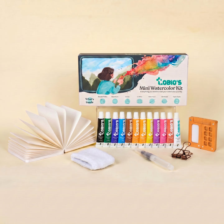
Starting from zero? The Tobio’s Watercolor Kit ($34) has the palette, paints, and brush in one box — and patience is the other half of the technique.
Mel, FounderLike these guides? Set Tobio's as a preferred source on Google and our pages will show up first when you search for watercolor questions.
More watercolor tutorials
Ready to build some depth?
The palette, student-grade pigments, cotton paper, and a water brush in one pocket-sized box — a solid starting point before you upgrade to a wider transparent range.
Get the Tobio’s Watercolor Kit


