


Watercolor Color Mixing Chart: How to Mix Any Color


What You'll Need
- Your kit’s colors (11 — Titanium White isn’t used on the chart)
- A brush and clean water
- The free printable grid (download link below)
- A scrap of paper for testing
Confession time: I used to buy a new tube of paint every time I wanted a color I didn’t already have. Color theory sounded complicated, so I avoided it — until I actually learned it and realized it isn’t hard at all. Your supply drawer doesn’t need to look like a hardware store; learn to mix and you can make most colors you need from just a few tubes.
It’s also freeing when you’re out and about — bring a few colors instead of the whole set and still get extraordinary results. Here’s how a mixing chart works, how to make your own, and a free printable to fill in.
What a mixing chart is and why it works
A watercolor mixing chart is a grid: your colors run along the top and down the side, and each cell shows what happens when you combine that row’s color with that column’s color. Once it’s filled in, you have a permanent, visual reference of your entire palette’s mixing range — not just the colors you own, but every combination they can make. Think of it as a cheat sheet, so you never have to second-guess a mix again.
How to make your own
- List your colors — write every paint in your palette, in the same order along the top and down the side of a blank grid.
- Load your brush with the row color and paint a small swatch in the first cell of that row.
- Rinse your brush, load the column color, and add it to the same swatch while it’s still damp.
- Let the mix settle for a few seconds, then paint the combined color into the cell where that row and column meet.
- Rinse thoroughly between every mix — a dirty brush will ruin your hard work.
- Repeat for every row and column, working one row at a time so you don’t lose your place.
It’s a little tedious, but completely worth it. Once it’s done, you never have to guess what two colors make.
Free printable chart
Want the easy option? If you have the Watercolor Kit, you’ve got 12 colors to work with — so I made a printable version of this grid. Just download the printable mixing chart, print it, grab your kit, and fill it in one little box at a time. Prefer to mix on-screen first? Try our free interactive Color Mixing Lab — tap two colors and see the blend instantly.
You’ll notice Titanium White isn’t on the grid, and that’s intentional: in watercolor you lighten a mix with water, not white paint, so White doesn’t earn a spot the way it would in acrylic or gouache (more on that below). One limitation: each paint is already as saturated as it gets — you can’t mix them punchier, though luckily they come rich and vibrant to begin with. Reaching for a color often and running low? Grab the 12 paint refills ($10.99).
The few rules that prevent muddy browns
- Stick to two colors, three at the absolute most. Every extra pigment pushes a mix toward grey-brown. Trusted references like Daniel Smith and Jane Blundell say the same — keep it simple and it stays clean.
- Favor transparent pigments over opaque ones. Transparent colors let the paper glow back through the wash; opaque ones block that light and look flat and chalky. Pigment properties and lightfastness are governed by ASTM D5067 if you want to go deeper.
- Keep your ratios even and your water clean. If one color dominates, the mix gets unpredictable. Keep your water jar clean — or, with the Tobio’s water brush, wipe the bristles on the wristband between colors.
Lighten with water, not white
This one’s counterintuitive, because you’d normally lighten a color with white. But white makes watercolor look chalky and opaque. Watercolor lightens through water: spread the same pigment thinner and the white of the paper shines through, making the color look lighter and more luminous. I use white for details and sparkle, never for mixing. A top tip: test on scrap paper to see how a color looks once you’ve thinned it.
Common mixes worth knowing
- Greens: a yellow and a blue. More blue gives a brighter, cooler green; more yellow pushes it toward olive.
- Oranges: a red and a yellow.
- Purples: the trickiest — a cool red and a warm blue gets you closest to a true purple.
- Darks and neutrals: instead of black from the tube, mix two complementaries (a red and a green, or a blue and an orange) for a richer, more natural dark. My how to make black watercolor guide walks through it step by step.
Where to go next
Want a wider range to mix from? The 50-color paint set ($34) builds on the colors your kit already has. New to setting up a palette in the first place? My how to set up a watercolor palette guide is a good start, and once you understand why certain mixes work, a deeper dive into warm versus cool colors is a natural next step. Browse the full watercolor tutorials hub for more.
Frequently Asked Questions
How do you make a watercolor color mixing chart?
Set up a grid with your colors along the top and side, then paint each cell by combining the two colors that meet there. Keep your brush clean between cells.
How do you mix colors in watercolor?
Load your brush and mix either on the palette or directly on the paper — and stick to two colors at a time for a clean result.
Why do my watercolor mixes look muddy?
Usually because you’ve mixed too many colors at once. Less is more — keep it to two, three at the very most.
How do you lighten watercolor without white?
Add more water. Thinner pigment lets the paper glow through, which lightens the color without the chalkiness white paint adds.
Stop guessing at color
Grab the free printable chart above, fill in one cell at a time, and you’ll never second-guess a mix again.
New to it all? The Watercolor Kit ($36) has the twelve colors, the palette, the brush, and the paper to fill your first chart.
Mel, FounderMore watercolor tutorials
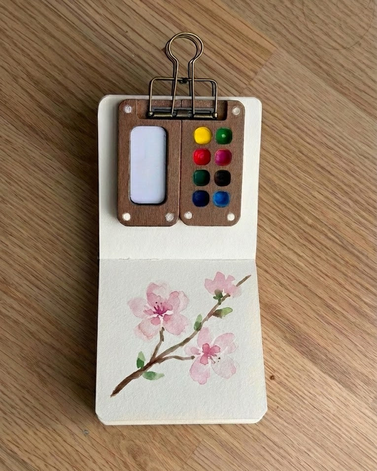
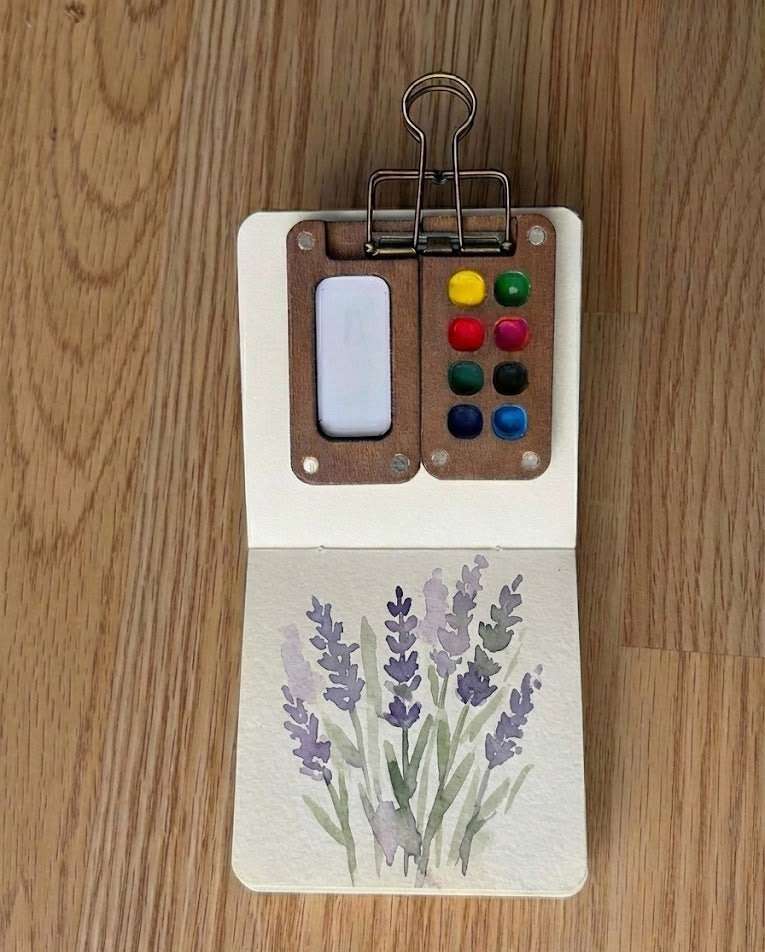
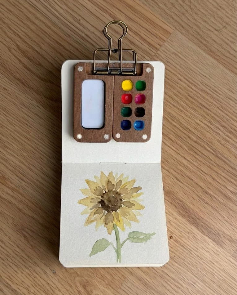
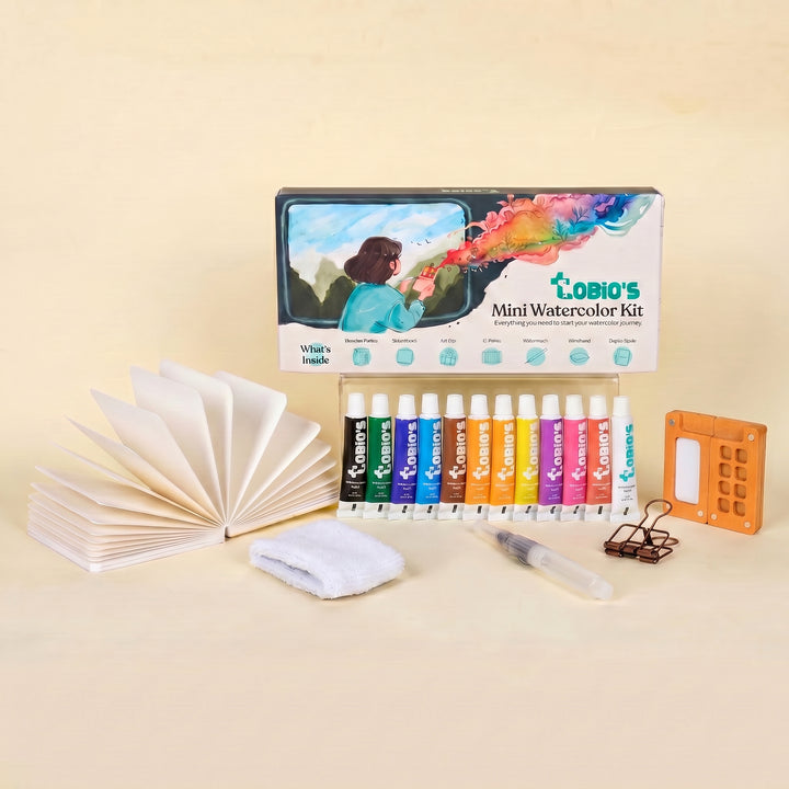
Everything you need to start mixing
Twelve student-grade colors, a magnetic walnut palette, a water brush, and 300 gsm cotton paper — the whole kit you need to fill in your first mixing chart.
Get the Tobio’s Watercolor Kit


