


How to Control Water in Watercolor Painting: Techniques and Practice Exercises


What You'll Need
- Paint in tubes or pans, plus a round brush or water brush
- 140 lb (300 gsm) paper, taped down or in a sketchbook
- A paper towel and a scrap sheet for tests
How to control water in watercolor painting comes down to two things you can check: how much water is in your paint mix, and how wet the paper is when the brush touches it. Paint mix consistency runs on a scale from cream (thick, deep color) through milk and coffee (mid-tones) to tea (pale, nearly clear), and each step changes how the color looks and dries. Brush load is the water the bristles carry, and a quick wrist flick over the palette shows whether it is too much before a stroke goes down. Paper wetness runs from dry to damp to wet, and the wetter the surface, the further the paint spreads. Heavy 140 lb (300 gsm) paper holds a wash long enough to work in, while thin paper buckles and dries unevenly. Practice those three checks one at a time and blooms, streaks and muddy patches turn into things you cause on purpose.
I made every water mistake in this post, usually twice. For a full year I blamed my brush before I noticed my paint was always too thin. Full disclosure: I make the Tobio's Watercolor Kit, and I will mention it once below, but the exercises here work with any decent paper and paint.
Key takeaways
- More water means paler color, less water means deeper color, and watercolor dries lighter than it looks wet.
- Flick your brush over the palette before a stroke. Large drops mean it is overloaded.
- Wait for the shine on wet paper to settle to a soft glow before dropping in color.
- Six short exercises build the instinct faster than painting full pictures.
The pigment-to-water ratio decides how color behaves
The ratio of paint to water on your palette sets how a color behaves before it reaches the paper. Too much water and the color looks thin and washed out. Too little and the paint drags and will not blend. The cream-to-tea scale gives you four names for the stages.
- Cream. Almost straight pigment, just wet enough to flow. Use it for dark shadows, final details and rich accents. It dries lighter than it looks.
- Milk and coffee. The working range for most painting. Milk is fluid and semi-opaque for mid-tones. Coffee thins it for more transparency and easier blending.
- Tea. Mostly water with a whisper of pigment. It looks almost clear on the palette. Use it for background washes and glazes, and apply it generously and quickly so it does not streak.
If you want more on mixing, the guide to using watercolor paint covers water ratios and pans versus tubes.
Your brush controls how much water reaches the paper
The water your brush carries lands on the paper the moment the bristles touch it, so checking the load is the fastest way to prevent a flood. Load the brush, hold it over the palette and give a gentle flick of the wrist. Large drops mean the brush is overloaded, so touch it to a paper towel first. A fine mist or a few small drops means you are in the right zone for smooth washes and soft blending.
The six water-control techniques and when to use each
Six techniques cover almost every way of handling water on a page, and one painting often uses several at once, with soft washes behind crisp details.
- Wet-on-wet. Wet paint on wet paper gives soft, bleeding edges. Pre-wet the paper, wait until the mirror shine settles to a soft matte glow, then drop in pigment. See wet-on-wet for more.
- Wet-on-dry. Wet paint on fully dry paper gives crisp edges and strong contrast. A cream mix stays almost exactly where you put it, while tea spreads slightly. See wet-on-dry.
- Charging. Drop a second color into a damp wash and let the water blend it. Too wet and the color floods. Too dry and you get a hard bloom line.
- Lifting. Press a thirsty brush, wrung out on a cloth, into wet paint to remove it. It only works while the paint is visibly wet.
- Glazing. A thin tea-consistency wash over a fully dry layer shifts color without hiding what is under it. See glazing.
- Dry brush. Thick cream paint and very little water, dragged quickly over textured paper. The bristles skip the grain and leave a broken mark that suits wood, grass and stone.

Cream-to-tea swatches
Start with your thickest mix and paint a small swatch. Add a little water and paint the next swatch beside it. Keep going in steps until the color is nearly clear, then label each one. Repeat weekly.
The wrist-flick drill
Load the brush, flick it over the palette, and look at what comes off. Then touch it to a paper towel and flick again. Learn the difference between a brush that makes large drops and one that makes a fine mist.
Gradient wash
Lay a cream stroke across the top of a rectangle. Pull each stroke below it with clean water only, adding no new pigment, until the color fades to near-white. If you see hard lines, the brush dried out, so work faster or tilt the paper slightly.

Paper wetness comparison
Paint the same stroke on dry, damp and wet paper side by side. Watch how far the color spreads at each stage.
Hard versus soft edges
Paint a simple shape on dry paper, then the same shape on pre-wetted paper. Compare the crisp edge with the soft one.
Lift and blot
Lay a wash and let it settle for a moment. Lift color back out with a thirsty brush, then blot the section with a towel. This teaches you how to rescue an over-wet area. Staining colors such as Phthalo Blue lift less easily than earth tones such as Yellow Ochre, so try both.
Which tools make practice easier
Good paper matters more than anything else you can buy for these exercises. My kit has a 60-page sketchbook of 300 gsm cotton paper, 12 colors and a refillable water brush, so you can practice the drills in a cafe or on a train. It is small, roughly postcard size, and the paint reads lighter than artist grade, so it is not for anyone who wants large sheets or very intense pigment. If that is you, a block of 140 lb paper and artist-grade tubes will suit better. The kit setup guide covers the first session.
Questions people ask about water in watercolor
How much water should I use in watercolor painting?
There is no single right amount, because it depends on the technique. Use the cream-to-tea scale: cream for deep color and detail, milk or coffee for mid-tones and blending, tea for light washes and glazing. Test on scrap paper, then adjust.
Why does my watercolor paint look washed out?
Usually there is too much water for the amount of pigment, so you are working at tea when you need milk or cream. Watercolor also dries lighter than it looks wet. Load a richer mix than feels comfortable, one step up the scale.
What causes blooms and back runs in watercolor?
Blooms are the cauliflower-edged shapes that form when extra water enters a wash that has started to dry. Make sure paint you add to a wet wash is at least as wet as the surface, and work before the paper slips from wet to damp.
How do I get crisp edges in watercolor?
Paint on completely dry paper with a milk-to-cream mix, and let each layer dry fully first.
Does paper affect water control?
Yes. 140 lb (300 gsm) paper resists buckling and holds washes evenly. The paper guide explains what to buy.
Ten minutes of swatches beats an hour of worrying
Every watercolor mistake I made in my first year came back to water. Too much on the brush, too much on the paper, or paint that was too thin for the job. Fix those three and most of the frustration goes away.
Do the swatch exercise once a week for a month. It is boring and it works.
Mel, FounderLike these guides? Set Tobio's as a preferred source on Google and our pages will show up first when you search for watercolor questions.
Keep reading

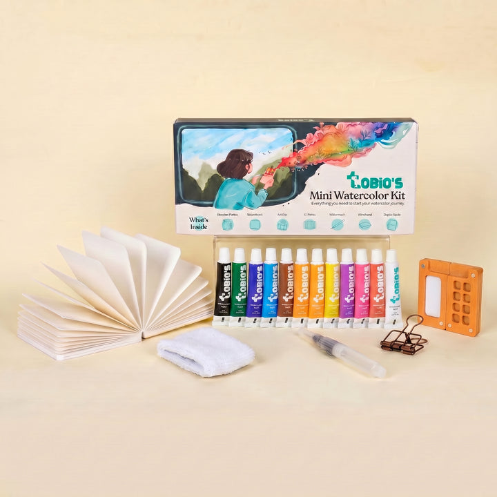
Practice anywhere, with paper that copes
Twelve paints, a walnut palette, a water brush and a 60-page 300 gsm cotton sketchbook in one pocket-sized box, with a video guide. $36.
- 12 colors chosen to mix
- 60-page 300 gsm cotton sketchbook
- Refillable water brush, no cup needed
- Video guide included

4.75/5 from 7,300+ reviews


