


How to Paint Watercolor Portraits: A Beginner’s Guide


What You'll Need
- A reference photo — convert it to black & white to read the values
- A pencil for light proportion guidelines
- Warm and cool colors for skin (the 50-color set gives more range)
- A fine brush for the eyes and details
Somebody’s face — that’s today’s task. Not a tree, not a sky, not a bowl of fruit that forgives every wobbly line. A face, and your brain has spent your whole life cataloguing exactly what a nose is supposed to look like.
Here’s the thing: beginners jump straight to detail because that’s what feels expected — totally fair, but usually not the best move. Painting individual eyelashes before you can even recognize the face across a room is too much detail too fast. The trick is to start with the big stuff: the shapes and the shadows, not the lashes or the exact pattern of the iris. Let’s do this the “dull” way — the way that actually works. It’s a lot of fun, I promise.
Start with values, not color
Study the monochrome before you paint a single color — turning your reference photo black-and-white is an easy way to do it. It shows you the values, not the shades, which makes the shapes of the face far easier to read. Values are the most important part of a portrait, because they show how light and dark interact — color is more like the seasoning. I like to start a face with three tones of a single grey or blue; it makes the bone structure pop so you can see the frame of the face.
Once the values are right, the color almost falls into place — no amount of “correct skin tone” can save a portrait with the wrong values. And if you’re unsure how dark something needs to be on the first pass, go a little lighter than you think. Shadows can always be deepened later; you can’t remove color that’s already down.
Getting proportions (tracing is allowed)
Copying the proportions from your reference by tracing is completely okay — it’s not cheating (you’re not in an official competition). Even professionals use grids, phone projectors, or tracing paper to get every part of the face in the right place. I like to mark where the nose, eyes, and mouth go with a pencil first, because watercolor is unforgiving and you can’t really erase once you’ve started. No one’s handing out medals for freehand.
Light to dark, thin layers
I’ll say it again: start light, then go darker or add layers, because you can’t paint light over dark to lighten it the way you can with gouache or acrylic. Each layer has to leave room for the next one to go darker. Begin thin and washed-out — paler than you think — and build a stronger mix only on the areas in shadow, a little color at a time.
A fun fact: this technique has real history. Museums with antique portrait miniatures describe how 1800s Victorian artists built portraits from thin watercolor layers — so as you work, picture an artist 200 years ago bent over a tiny painting on ivory. And for deep shadows, don’t reach for black straight from the pan; it can look flat and lifeless. My black watercolor mixing guide has a couple of rich, dark mixes that read as shadow rather than a hole punched in the paper.
Believable skin needs warm and cool
We tend to think skin is always warm — a common misconception that traps a lot of beginners, who pick one peachy mix and spread it over the whole face. (No judgment; we’ve all done it.) But skin comes in a range of warm and cool tones, often in the same face: cheeks and nose lean warmer, while the jaw and under-eyes run cooler.
With the Watercolor kit you have 12 colors to blend from — they were made for beginner subjects like landscapes, flowers, and houses, and they shine there. For faces the 12 can feel a little limiting, so you may have to blend quite a bit; that’s okay, as long as you’re not chasing hyper-realism on day one. If you get serious about portraits, our 50-color set ($34) gives you far more range to choose from.
Eyes bring it to life
The eyes are the windows to the soul, and here they’ll likely be the highlight of your portrait — but they’re tricky. Most beginners overdo them, painting eyelashes as crisp individual lines, which rarely looks natural. It’s usually better to keep it simple: a soft dark shape where the lash line sits, maybe two or three lash marks at the outer corner. I used exactly this in my Jesus portrait study, where keeping the eyes soft and slightly downcast gave the whole piece a calmer feel than sharp, staring detail would have.
If you do want finer work, it helps to have the right tools — my brush set ($21.99) has 12 brushes to cover it. And work on the whole face at once so the features match: get too focused on one eye and it’ll look off against the rest once you step back. Work in stages and revisit areas until you’re happy — don’t let one feature get far ahead of the others.
Work small, and which colors you’ll actually want
Start around postcard size. Big portraits make errors bigger and more obvious when a feature is slightly off; starting small and scaling up is the most useful thing I’ve learned.
If you want my color recommendations: Venetian Red and Sunset Orange carry most of the warmth for cheeks and nose, and Electric Rose adds a little more pink without going bubblegum. For cool areas, Royal Plum and Twilight Indigo work well in the shadows under the jaw and around the eye sockets. Ivory Black can deepen a shadow, but mix it into a warm color rather than using it straight. None of these were built specifically for skin, which is exactly why the 50-color set is worth it once you’re painting more than landscapes, florals, and fruit.
Common mistakes
- Individual eyelashes. Crisp, separate lashes rarely look natural — a soft lash-line shape reads far better.
- Overworking an area. This happens when you add color before the layer underneath is dry, or mix too many colors at once. Let layers dry and keep mixes simple.
- Too much detail too early. Start slow with the big shapes; add details last, once the large forms are already there.
Ready to try it?
The 50-color paint set ($34) gives you the range of skin tones you need, and the artist brush set ($21.99) handles the detail around the eyes and mouth. If portraits feel like too big a step right now, go back to basics first — my beginner’s guide is still there for you, and the tutorials hub has plenty of lower-pressure subjects.
Frequently Asked Questions
What are the steps for a beginner watercolor portrait?
Begin with a monochrome value study to capture the light and dark shapes, work light to dark in thin layers, and add the eyes and fine details at the very end.
What colors do you use to paint skin in watercolor?
Skin has both warm and cool tones, so use both. Warm mixes for cheeks and nose, cooler ones for the jaw and under-eyes — rather than one flat peachy wash.
How do you start a monochrome portrait?
Choose one color, mix it to three or four strengths, and paint the light, medium, and dark facial areas first before introducing any other color.
How do you create a likeness in watercolor?
Get the proportions right before any paint goes down — tracing or lightly transferring your reference is a smart, legitimate approach, not cheating.
Stop chasing eyelashes
A portrait isn’t built from the parts that seem most important. It’s built from values, from proportions you got right before the paint went on, and from warm and cool sitting side by side instead of one flat peachy wash. The eyelashes are the last thing to worry about.
Stop chasing eyelashes. Start with the values.
Mel, FounderMore watercolor tutorials
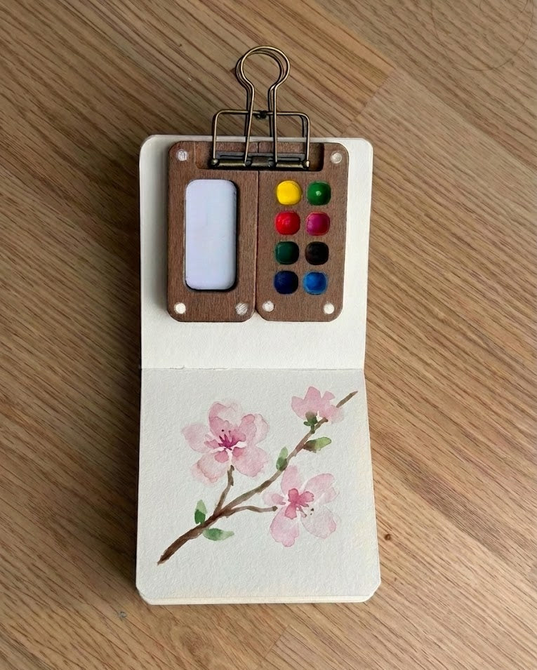
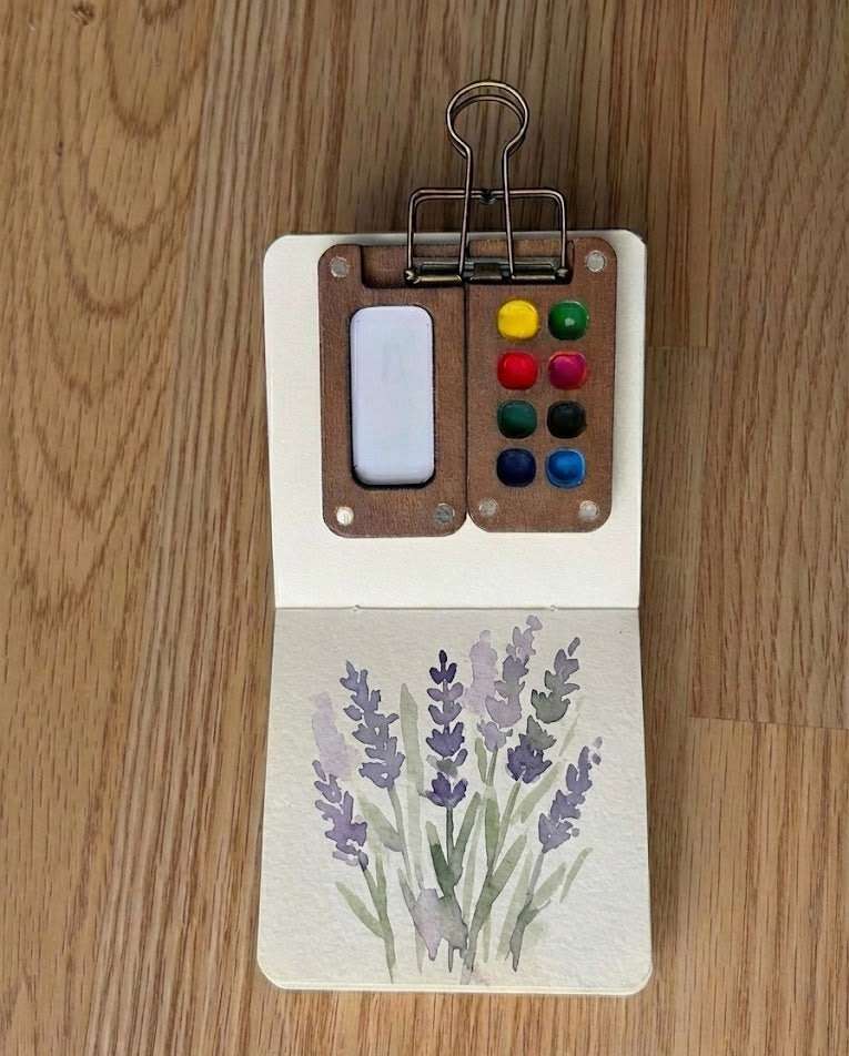
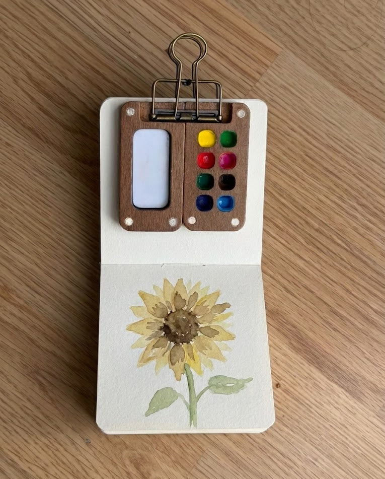
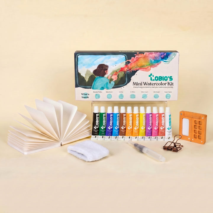
New to watercolor? Start here
A palette, student-grade pigments, cotton paper, and a water brush in one pocket-sized box — the easiest way to start before you branch into portraits and a wider color range.
Get the Tobio’s Watercolor Kit


